Start back at start
It was almost a year ago when the first Redesign Process article was published. At the time I had just finished wrapping up and releasing Devlounge 2, the theme that actually was just released for free to the WordPress community. It felt like such a refresher, such a change, and a step in an entirely “new” direction for Devlounge.
It would take me almost a year, along with a bunch more “little” steps before the site would actually change the “core” design – which had stuck the same since April of 2006. After redesigns and redesigns, Devlounge 8 was born in June 2007, (yes, we pulled that Winamp thing and skipped just a few numbers) and a new mindset finally hit me – one that should have occurred a long time ago.
Design, Design, Design – Waste of time, time time
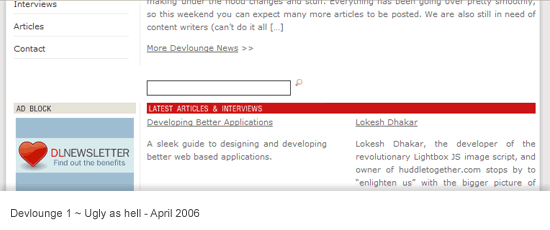
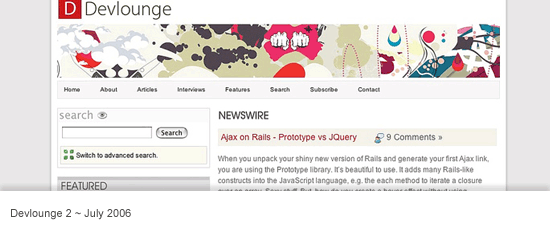
Looking back, it is quite unbelievable to think I spent so much time and put so much focus into redesigning a site that never had to be redesigned. I guess it is just one of those learning curves you have to experience to understand. That is until someone else tells you otherwise, and I’m doing just that. Throughout 2006 and early 2007, Devlounge underwent three published renovations or redesigns. The first being the design Devlounge initially launched with, in April 2006. Shortly after in July 06, Devlounge 2 was born. Then in October, I followed everything up with another slight refresh.

If you’ve been keeping count, that was three redesigns / refreshes in just about 7 months (April to October). That means in those 214 days, each design was up for about 71 days, or just about two months. Out of control? You bet. Luckily, with the release of Devlounge 3 in October, things finally began to stabilize. In fact, Devlounge 3 alone survived longer than any of the other designs, and thankfully slowed down the pace or else we would have gone through another three designs before Devlounge 8 was launched.

As I write this, this is the first time I’m emerging myself in the statistics that were the very many Devlounge designs. It is amazing I spent so much time redoing things that had no need to be redone, especially when you consider that Devlounge was less than a year old and I had more important things I should have been paying attention to than design tweaks.
Setting Out with Something to Prove
When April hit us this year, I found myself constantly looking at the Devlounge homepage and being bored it with it. There were inconsistencies I spotted all over the place, and a lot of focus on all the wrong things. I wanted that to change – and quickly. As soon as I brought up the idea of a redesign, the outcry began. Everyone was telling me I spent way too much [expletive] time redesigning, and I should be focusing on content. And instead, off I went, ignoring their suggestions and moving on with plans for a new design.
So in April 2007, I held a redesign contest. I was game to see what I would get with an overflow of entries, but I was disappointed when the contest drew to a close with just one entry, from Greg Wood. The design was clean and white, and I planned to code it up and put it to use as soon as possible.

As soon as the PSD was turned over to me and the contest winnings sent, I began playing around with things. Before long, I had rough ideas that were totally different then the contest winning entry, but they were somewhat loosely based upon it. Sketch after sketch, retry after retry. I worked on things for a month, and eventually settled upon something I liked.
There were things I set out to accomplish with the new design from the start. They were all issues that the previous “redesigns” hadn’t done anything to address, even though each time I said they did.
- Focus on Articles – The first thing you saw when visiting Devlounge from October to just a few weeks ago was homepage news – site updates that had very little to do with anything. I could have said “I just got smashed, the site will be closed this week!”, and that would have been the very first thing an incoming audience would have seen. Articles, of course, were found under the homepage news blurb, but I felt they deserved to be higher up, and have more prominence on the page.
- Fresh Sketches – I had been using the same illustrations for over a year, and people were getting tired of them. I knew I had to find an illustrator to put together some fresh work, because people really thought the “artistic touch” was something that made Devlounge stand out.
- More on the homepage – At the same time, the homepage needed to be redone and stuffed with information. We needed things that would pull people in, and not drive them away. Whether they were first time visitors or daily readers, the homepage needed to stand out and make its mark when they first saw it. The layout also needed to go in a completely different direction, and break out of the mold it had been in for the past year.
- Retain familiarity – The last thing I wanted to do was to keep the core inner pages the same or close to it. Long time readers didn’t want to visit the site and put on a lab coat to run experiments and figure out how new things worked. Maintaining some of the original, long-time appearance was important.
Stepping up, Stepping out and the Critics Reaction
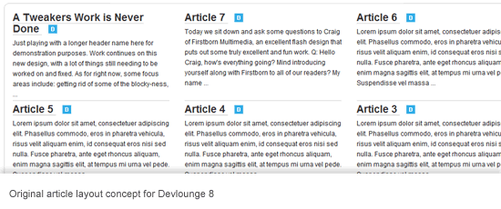
With Devlounge “8”, I felt that I met many of these goals. The homepage did change – significantly – for the first time since launch. Articles were now moved to the top, with a last minute change to have one featured and titles of others underneath (after the original plan called for two rows of three, totaling six articles with excerpts). Other pages were redone and reorganized, including the articles and interviews index (with the Article index still needing work, but not right now). And, throughout all this, inner pages remained with the same basic layout, so long-time readers and visitors could still feel like nothing had ever changed.
With the new design also came the promised end of any more redesigns. The focus, as it should have been all along, is returning to the content. I put so much time and effort into useless and purposeless designs, that I had no time to write anything. I guess it is a good excuse for any time you have ever seen me make a typo in an article – I can just say I was busy redesigning a site that did not have to be redesigned (laughs). Of course, redesigning is appropriate and can be very helpful to site traffic, readership, and more – when used in moderation. When you over do it, and lose focus on what your site is supposed to be about, it can hurt rather than help. Looks are not everything, and that is something I forgot for too long.
So here we stand, with the newest Devlounge design, and the story of how and why it came about. The biggest issue most people have had with this design is the homepage; many saying that it is unbalanced because it gets busier and busier as you scroll down. Still, complaints have been wide spread, so I’m willing to sit back and walk this one off. I have other things to do then start hitting the canvas for any more redesigns. There is writing to be done.

