Here’s another roundup that’s not only inspiring but useful for web designers: websites showcasing the elegant and exciting qualities of typefaces you can purchase.
Designs of the Week
Search Optimized, Turn-Key Designs, Unlimited Everything. Start building with the Genesis Framework today.
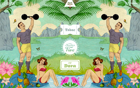
Like a photowalk, replace the “photo” with “font” and “walk” with “scroll”. One of the highlights of this interactively scrolling one-pager is seeing different fonts of the same family morph from one into the other in the same context, as well as their varying ligatures. There are even cool transition effects for it, like a diagonal transparent gradient gliding over the screen, mimicking uncovering a page, and fun examples like slot machines, medals, and badges.
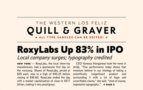
An insanely in-depth page with multiple layouts showing the typeface specimen—articles, headlines, signs, letters, book spines—all in live HTML and CSS. So you can see some cool effects like stroked text, shadows, and gradient fills. But the best part is, everything is editable! Now that’s true interactivity for people who want to try before they buy.
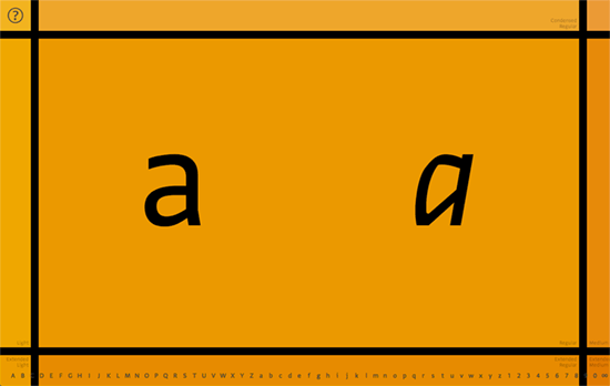
This site takes a glyph by glyph approach and off-canvas transitions to display the families: clicking on the edges of the page slides to that adjacent page. On the bottom you can pick the letter or number that’s displayed. A darker yellow signifies a heavier font weight.
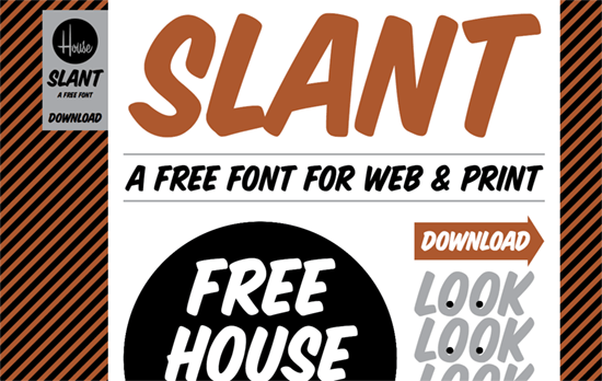
Strong elements all around—on top of all the capital letters, even the striped background isn’t one to shy away. The googly eyes in “look” are animated left and right. Layout and text sizing is responsive. I wish all of the form elements were done with live HTML, and for even more brownie points, the animated stripes.
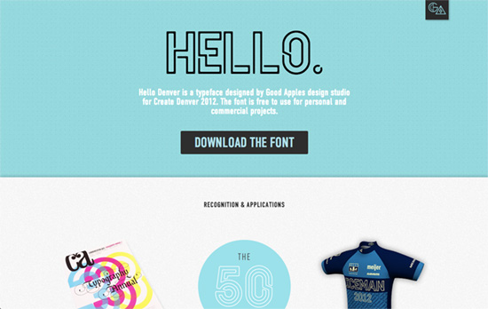
Simpler compared to the other designs featured on this list, but still quite pleasant. Good call to add accolades on the page and photographic evidence of the typeface usage in real life.
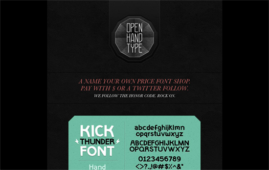
Dark look brightened up by a couple of greens and a spirnkle of red. Several kinds of textures are in use here, somewhat echoing the use of various typefaces as well.
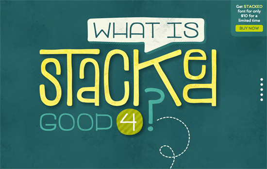
Cheerful illustrations coupled with tongue-in-cheek examples of the font in action. I just wish that the complete glyph listing were in a more creative presentation than a lightbox.
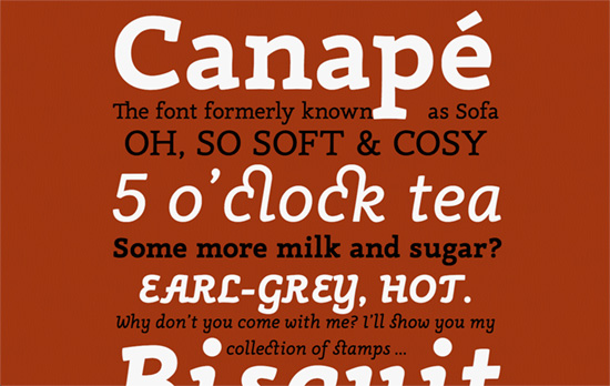
There’s a more educational and informative slant for the design and content of this page, and the speciment is relegated to the PDF like most other fonts are, but it’s still an appealing site.
Social Media Weekly
Pagelines lets you build WordPress websites and it’s as easy as drag and drop, go check it out!
Web Standards – DiagnostiCSS
“Visually detect any potentially invalid or inaccessible HTML markup”
CSS – Sizing (Web) components
“So how can we make it easier? Well, by sneaking aTrojan horse into your components and use it to control all the size related CSS properties.”
Javascript – Which JavaScript Library Should I Pick?
“Since a JS library is often used when developing a user-facing product, I think of the strategy as satisfying two audiences: the developers that must code and maintain the use of the library, and the users that will interact with it.”
