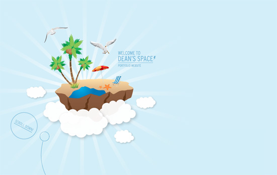
Design techniques are fleeting, so it’s hard to determine what’s simply trendy, and what actually works. Here we stand in 2016, though, and parallax design is still as popular as ever. If you haven’t experimented with parallax design, now may be the time to give it a try. [Read more…]
Search Results for: parallax
Friday Focus 04/29/11: The Parallax Effect
This week on Friday Focus we feature what is probably the most famous non-Flash animated effect employed in websites today.
Designs of the Week
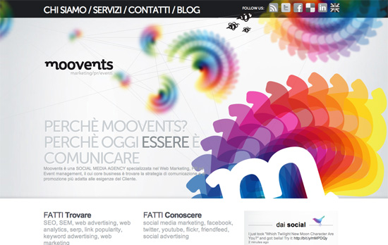
Love the running theme of the rainbow spirographs not only in the heading but in the icons. Interestingly the parallax effect disappears in inner pages, probably to avoid tiring the visitors out, although I personally don’t mind.
I really have no complaints about this one-page site, just the use of Cufon instead of straight-up web fonts.
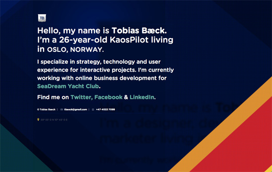
Love the bright colors and and slanting shapes, and the animation that appears when hovering on links—which is usually tacky but in this case it works.
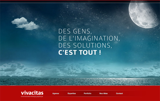
Note that in this design, the parallax happens in the footer, as you move your mouse in that zone, and not as you scroll from one section to another.
One of the best implementations of parallax out there. There are cues for which section of the page you’re in, uncovered layer by layer, and each heading is linked to the next via dotted lines.
Here’s another parallax that doesn’t happen on scroll and those connecting lines.
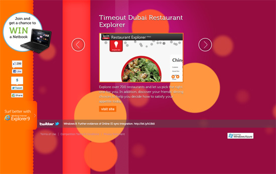
Another popular technique: slideshows within slideshows. Here I think some of the background circles are a little too big.
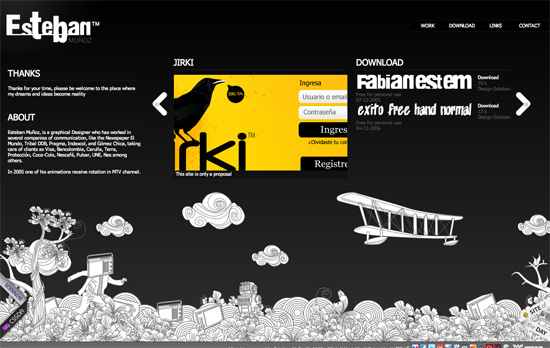
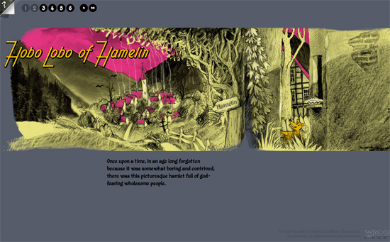
Not fond of how there are both horizonal and vertical scrollbars, but the animations and illustrations are quite impressive, especially the ones that activate when they’re in focus.
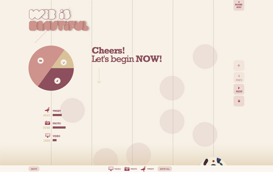
The parallax isn’t even the most fascinating feature of this design. The circular motif is certainly another hit trend and this site runs away with that idea.
Social Media Weekly
CSS – CSS Stress Testing and Performance Profiling
” I realized fairly quickly that CSS was to blame. Disabling JavaScript had no effect, but disabling all CSS instantly fixed performance.”
CSS – Setting CSS3 Border-Radius with Slash Syntax
“Because the standard way of declaring the border-radius values (discussed above) has become so widespread, you may not be aware of an alternative syntax for this property.”
HTML – The HTML5 Switch
“Really though, you don’t have to rebuild everything, not use everything in HTML5 for it to be worthwhile switching your doctype now.”
4 Compelling Homepage Designs Worth Mimicking
Your website’s homepage is the portal to your online brand. If you nail the homepage, you’ll wow people from the start. Flop there, on the other hand, and you’ll find it very hard to overcome that poor first impression.
You can better your odds of success by learning a thing or two from what others are doing. Below are four compelling homepage designs worth studying and emulating. [Read more…]
Can You Make It Work? Pushing The Limits Of Creative Web Design
With the number of innovative, yet intuitive sites on the web today, creative web design is vital – it draws readers in and keeps them interested. In pursuit of the most interesting design, however, some designers push the limits too far – producing unreadable, distracting, or an otherwise poorly organized product. And when it comes down to it, unreadable loses to boring every time.
How do you know when you’re pushing the limits of creative web design successfully? Take a hint from these sites and you’re sure to get great results. [Read more…]
5 Premium WordPress Themes Which Have Definitely Nailed It
Let’s face it, finding the perfect WordPress theme that fits your requirements can be a tiresome task. The burden of creating a great website is not limited only to the actions “purchase” and “transfer domain name”. Choosing the right theme to go with your site can be an exhausting undertaking and there’s a reason why. Sometimes, it’s almost impossible to discover a theme that suits your client’s ideas and makes a statement with a stylish appearance and user-friendly layout. WordPress themes, as any other product on the market, be it physical or digital, tend to suit only specific purposes, without paying better attention at the big picture.
Premium WordPress Themes: Great Design and High Functionality In A Single Package
Allured by the idea of quick success, most web developers endeavour to create digital products which fit a certain target group and focus either a clean code or deliver a great looking product with less flexibility. Yet, customization is one of the most important features of website templates and this leads us to our first pick.
Sk8ter
The Sk8ter theme is hands-down one of the most featured-packed WordPress themes that can be found in the digital marketplace.
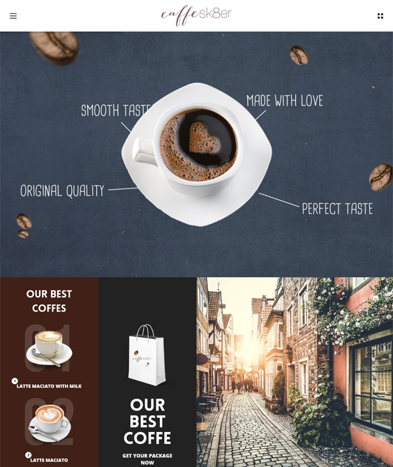
Source: http://templates-website.net/wp-content/uploads/2015/03/sk8tercoffee.png
The ability to change a theme’s appearance determines the make-it-or-break-it point for customers. Truth is, fixed designs don’t suit web developers for a number of reasons. Knowing that, the guys at AVA Themes have developed this theme to suit each and every requirement of the modern customer, starting from the necessity of specific customizations and delivering a web project which offers high functionality and good looks without making compromises on user-friendliness.
Sk8er is a multi-purpose theme which offers a bundle of features, from an extended amount of pre-made homepage designs, Bootstrap and Woocommerce to simplifying customization via a visual composer and offering more than 70 blocks which make modification easy as a breeze.
The need of WordPress themes which aim at excellent performance and good looks has resulted in the creation of some of the most widely appreciated design products that can be found online.he need of WordPress themes which aim at excellent performance and good looks has resulted in the creation of some of the most widely appreciated design products that can be found online.

Source: http://0.s3.envato.com/files/131843779/previews/01_banner.__large_preview.jpg
Vira introduces a whole new approach to creative web development. The sleek design of this fabulous one-page WordPress theme will make any web designer awe with inspiration. Vira is a gorgeous theme, created by a team of dedicated developers and it promises a 100% user satisfaction by offering a number of unique layouts.
Have you ever dreamed of created a website design that rather compliments photography instead of mindlessly shuffling gallery containers with the hope of more exposure. Truth is, photography requires space and having a stuffed design will only add to its complexity and move the focus away from the site’s main purpose.

Source: https://cdn3.colorlib.com/wp/wp-content/uploads/sites/2/photome-fullscreen-photo-theme.jpg
The crew behind ThemeGoods has managed to take away the most important lessons from minimalist web design. They have built a photography theme which ideally blends the breath-taking beauty of photography with the humble elegance of modern minimalism. Photome comes with 8 demo pages and 50+ gallery templates which make customizing this theme a true delight.
Kalium
This gorgeous WordPress theme, found over the Envato marketplace, embraces and celebrates minimalism.

Source: http://cdn.kaliumtheme.com/assets/img/agency.png
Created by Laborator, the Kalium theme features a clean design refracted through the prism of a unique concept. Laborator’s WordPress theme projects revolve around the idea of creating a periodic table of website templates, each of which represents a different concept.
What makes Kalium stand out from the crowd is the theme’s crisp design which features clean minimalism. The theme has a monochromatic layout and uses typewriter font to create the perfect minimalist appearance. The theme’s clean look is a perfect solution for blogs and portfolios. Kalium’s sleek appearance and simple style help great content shine.
Oshine
Seeking a multi-layout team with a beautiful interface and a multi-purpose functionality? Oshine has won a grand price in many theme rankings as being one of the leading website templates that can be found in the digital marketplace.

Source: http://www.webcreate.me/wp-content/uploads/2015/07/oshine-best-portfolio-theme.jpg
Oshine offers 18 unique page template demos which combine different layout options. The theme uses user-friendly page builders and has powerful customization properties. The team at BrandExponenets has aimed at creating a striking balance between delivering high-end design and flexible functionality.Oshine has a unique design and offers limitless possibilities portfolio design. The theme comes with Master Slider and has great image sections, from parallax overlays to background videos.
