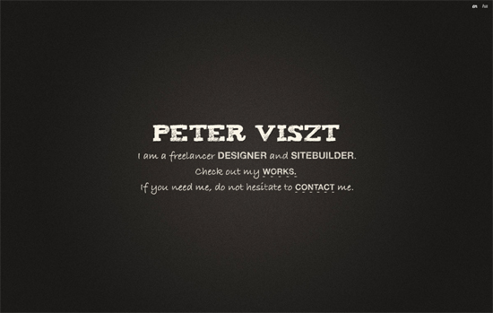
I have a thing for minimalistic websites, because they don’t require intricate graphics and yet they are harder to create then a non minimalistic websites. It’s very difficult to create less and still have a beautiful page. If I could finally sit down and teach myself to use a decent grid I can create the ultimate page to my taste; grid based and minimalistic.
I recently made a single page site myself and it took me way longer then a multi-paged website. Having the right background, color and font takes time and serious consideration. Now that last one is true for every kind of design but with a minimalistic page there isn’t a lot to focus on or distract. Now we all have opinions on what makes a website minimalistic, the line on that one isn’t an exact science. Web design is still art and art was never an exact science.
When you really want to focus on content, minimalism is one of the best ways in my opinion, meaning that there aren’t other factors on the page that take away from the key content. With that on mind I selected 15 single page websites that are beautiful and well done. I hope these will serve as an inspiration for you and inspire you to try create a single page website.
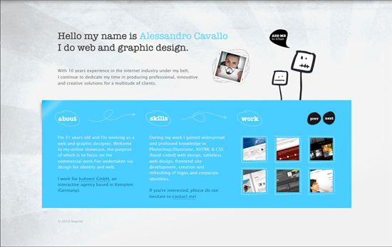
Alessandro Cavallo
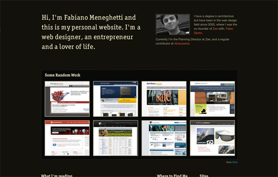
Fabiano Meneghetti
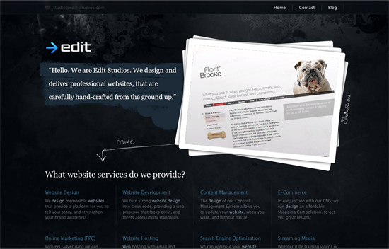
Edit Studio
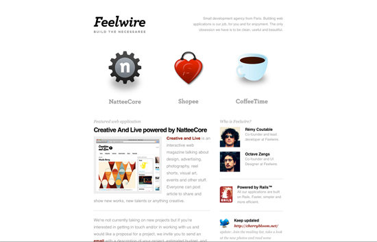
Feelwire
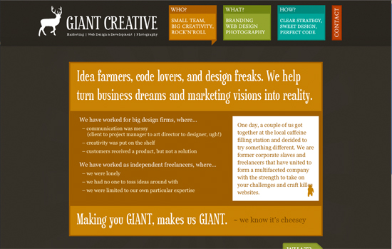
Giant Creative
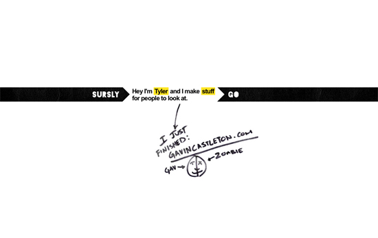
Sursly
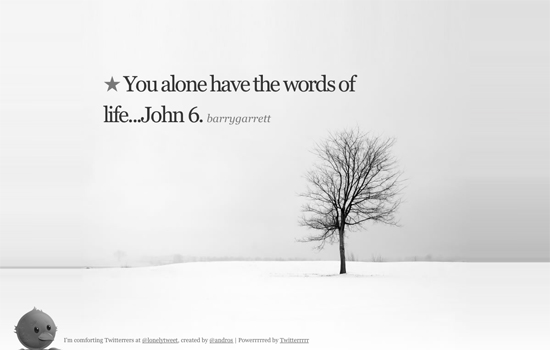
Lonely
Dan Tobolic

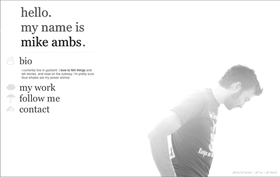
Mike Ambs
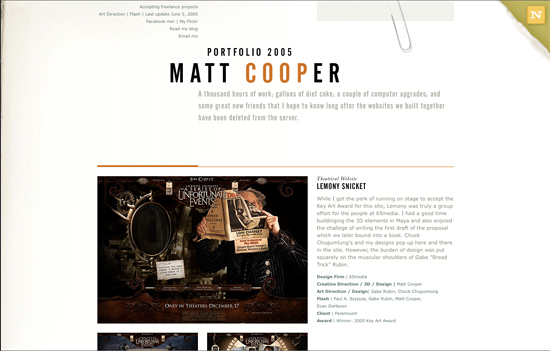
Matt Cooper
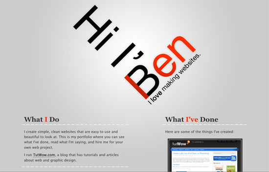
Ben Lind
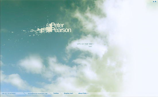
Peter Pearson
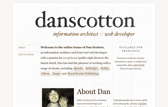
Dan Scotton
Peter Viszt
