Images don’t need to reside in strictly rectangular boxes. Check out these sites that use out of the ordinary shapes for masking photos. Happy Friday Focus!
Designs of the Week
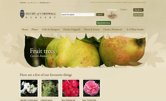
Like choosing font embedding instead of text replacement with images these days, masking that preserves the original shape of the image is preferred, but more tedious. What I find interesting here, though, is the use of GIFs instead of the usual slideshow script.
It looks like the logo influenced the look of the entire site, and it looks great. I just find the body text a little too low in contrast against the backgrounds.
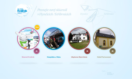
Nice color-coded circles for navigation, with a bit of a pushbutton effect for the arrows. I quite like the watermark map at the top right.
The header images break the otherwise clean, corporate feel to this design, echoed to a lesser extent in the footer divider. Just one little niggle: the logo looks blurry.
I like the thread (power line) that links one image to the next, and even the larger hover images makes you curious as to what the full picture really is like. That’s probably the most effective use of masked images.
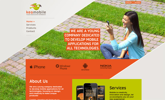
I always love it when a site breaks out of the top-down, left-right conventions, and this one hits two birds with one stone: it’s still straightforward in layout but the diagonal borders makes the site feel more dynamic, and gives the feeling that you’ve stripped away the gray to reveal the more colorful layers underneath. All while maintaining readability and professionalism in the look.
Social Media Weekly
CSS – My New Best Friend: CSS Generated Content
“In an effort to use fewer and fewer images, I’ve started to use generated content more since more browsers support it. (IE8+, FF3+, Safari 4+, Chrome 4+)”
Design – Dear Photoshop user, meet Fireworks!
“Isn’t it time that we have a web design application that speeds up and enhances our web design workflow? Well listen up Photoshop user, let me introduce you to Adobe Fireworks.”
Typography – Type Folly
TypeFolly is probably the first web typography tool that allows designers to easily create beautiful “type follies”. The result is a fully html & css3 compliant code.
CSS – Awesome Pure CSS3 frame boxes (no images)
“We have designed this set of high quality boxes without using images, pure CSS3 advanced techniques.”
Programming – Editing Code in the Cloud
“I’ve thought for a long time about the possibility of being able to do all of my programming in my browser. It feels partly impractical but partly like a really neat idea. Imagine being able to hack together some code from anywhere, with or without your own computer.”
CSS, Accessibility – Hiding Content for Accessibility
“For years now, we’ve used a number of techniques for hiding content offscreen for accessibility purposes. We do this because the content is still accessible to screenreaders while being removed from the interface for sighted users.”
User Experience – The Anatomy of a Perfect Login Page
“Login forms are very simple in terms of the required elements. When it comes to forms, it doesn’t get simpler than that. But some of the elements that could be valuable to your users (or potential members) are often neglected.”
CSS – CSS Value Lengths, Times, Frequencies and Angles
“In this article we go over all the math type units that can be applied as property values in CSS.”


