This week on Friday Focus: websites that are split right in the middle! Is there a schizophrenia outbreak somewhere that caused these designers to break the rule of thirds? Let’s find out.
Designs of the Week
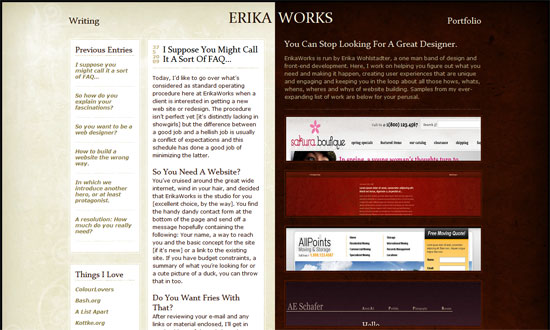
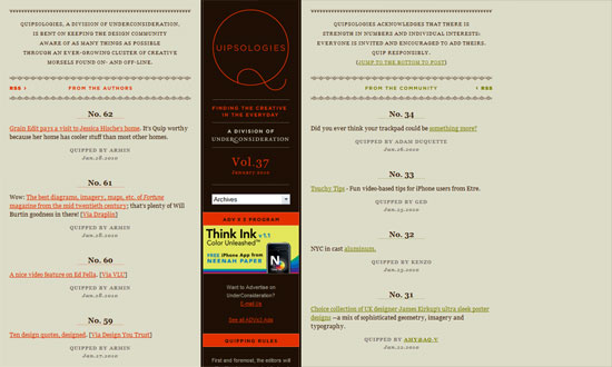
A great opportunity to exercise good contrast. And a neutral tone against a deep red gives that rich, royal feeling.
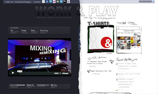
The schizo’s kicking in. Love the code peeking out in the middle, and that the right half looks hand-drawn.
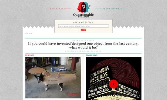
The text is way too small, but otherwise a great look.
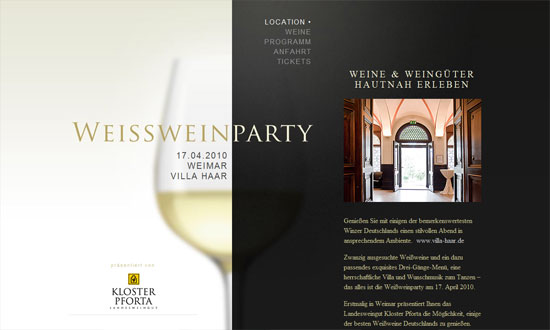
Very classy. I just wish that one didn’t have to scroll up and down to read the content and then select a new item from the menu, which could have been fixed in its place.
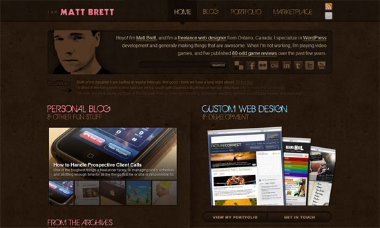
Pixel-precise graphics are still in vogue. And you can’t do better than the logo!
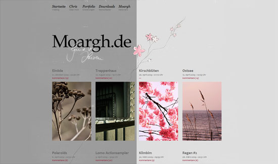
A nice touch in the Twitter area: the older the tweet, the more faded it is. Pink and brown is a pretty sweet combination too—and the site belongs to a guy!
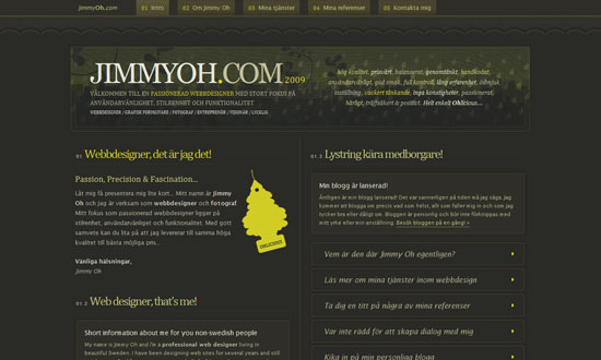
Lots of lovely little details here, and no stone was left unturned.
This site looks elegant but not too stifling, and has touches of quirkiness here and there.
Social Media Weekly
Design – Front-end Quality Levels
Programming – Find The Right JavaScript Solution With A 7-Step Test
UX – Label Alignment in Long Forms | Paper Prototyping for Engineers
