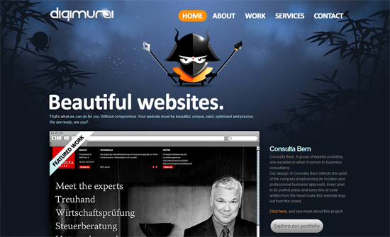
These Japanese warriors seem to be very popular figures in design and tech companies, so let’s see how these websites take off on the concept. Welcome to this week’s Friday Focus!
Designs of the Week
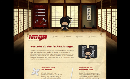
Clearly the header image is too narrow for wider screen resolutions but it doesn’t look bad like this. Love the hanging look of the content and the weapons as icons everywhere.
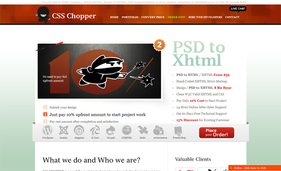
Instead of listing recent work on the page, they surprisingly show up in the flyout menus. This design seems to prioritize keywords over portfolio.
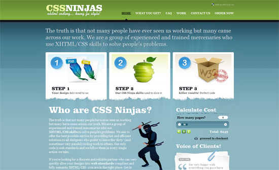
Doesn’t feel too ninja-y, but looks very elegant.
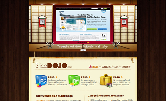
Do we have copycats in this list? The carousel integrated into the sliding door panel is clever, but the rope and hanging paper looks almost exactly like the first site featured here, with ninja star icons in the menu as well. Who copied who?
I like how the content area needs no background so the rest of the design shows through without much distraction.
Social Media Weekly
Business – Building the Trunk, First
“Why you should focus on the core of your product.”
Design – 10 Designers Share the Process of Creating Their Amazing Design Work
“In this article you’ll find 10 designer share the process of creating their amazing design work, which I hope can help you to get some inspiration.”
CSS – What’s the Difference Between :before and ::before?
“I had assumed that there would be some difference in the way each functioned, but that’s not the case, as the short and long answers below make clear.”
HTML – Get familiar with HTML5!
“We’ll advise you on how it can fit into your learning right now, even if you are a novice web designer or developer, and we will look at some of the main features of HTML5, so you can see what it adds to the already powerful HTML language.”
