CSS3 Is together with Canvas one of the more exciting elements of web design. With this post we want to showcase some awesome techniques to improve your design with the help of CSS3.
Custom Fonts With @font-face
Go beyond the standard web safe fonts Arial, Helvetica, Verdana and Georgia and start
using beautiful typography to enchant your design. @font-face is supported in all web browser if implemented correctly. An example of @font-face supporting Internet Explorer, Safari, Chrome and Firefox:
Sample Code
[css]@font-face { font-family: ‘Museo’;
src: url(‘fonts/Museo.eot’);
src: local(‘Museo’), local(‘Museo’),
url(‘fonts/Museo.ttf’) format(‘truetype’); } [/css]
Read all the details about using @font-face here at Devlounge, find web fonts with @font-face or read Becoming a Font Embedding Master by Jonathan Snook.
Get started right away with Hundreds of @font-face Font Kits at Font Squirrel, ready to use.
Drop Caps
Now that you know how to implement fonts on your website you can go a step farther and use drop caps for more typography effect.
Mark Boultons website is a stellar example of drop cap use.
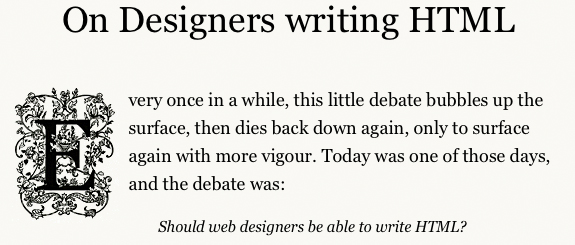
While the most common CSS3 way is to use
Sample Code
[css]p:first-child:first-letter {}[/css]
Boulton uses CSS3 attribute selector combined with image sprites technique. He chooses this way due that the caps are images and not a font.
Boultons way:
Sample Code
[css]div.post span.cap[title=”F”] {
padding: 40px 95px 40px 0;
margin: 0 10px 0 0;
background-position: -456px -10px;
}[/css]
The more simple way is with fonts as shown on Drop Caps the cross browser way
The RGBA Color Method
With RGBA you use the the amount of red, amount of green, amount of blue, and the level of opacity. Instead of using a hex (#) code. The RGBA method is used often in many CSS3 buttons effect. RGBA is one of the most easiest CSS3 properties as it’s juts a matter of checking in Photoshop or your design app of choice what the color codes are.
RGBA transparency is much better then the opacity property. When applying opacity to a div box it will be applied to everything contained in the div, may it be text or image. While RGBA transparency is only applied to the div it’s assigned too and not to its content.

Sample Code
[css] h1 {
color: #000;
background-color: rgba(255, 255, 255, 0.5); }
[/css]
Source: Working with RGBA colour
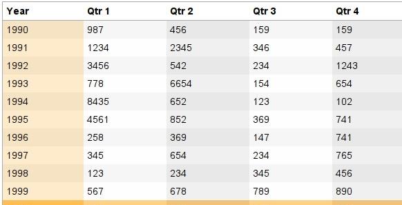
Learn how to apply RGBA in tables to create multi-colored rows and columns to enchant your data tables with Coloring Columns and Rows on Tables with CSS3 and RGBA.
CSS Gradients
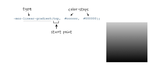
This is one of the more complicated CSS3 techniques, especially for web-kit browsers the code can get really intricate, while for Mozilla browsers it is pretty simple after looking at web-kits version.
Sample Code
[css]
-moz-box-shadow: 0 10px 16px rgba(66, 140, 240, 0.5), inset 0 -8px 12px 0 #6bf, inset 0 -8px 0 8px #48c, inset 0 -35px 15px -10px #7ad;
-webkit-box-shadow: 0 10px 16px rgba(66, 140, 240, 0.5), inset 0 -8px 12px 0 #6bf, inset 0 -8px 0 8px #48c, inset 0 -35px 15px -10px #7ad;[/css]
It’s imperative to know how to use gradients so you can improve your CSS only buttons. The next item on the list relies heavily on precise use of gradients to get the best effect.
Source: Cross-Browser CSS Gradient
Google Style Buttons
They are neutral, uniform and fit for most designs, now with gradient support for Firefox.

Sample Code
[css].buttons {
padding: 3px 3px;
-webkit-border-radius: 2px 2px;
-moz-border-radius: 2px 2px;
border: solid 1px rgb(153, 153, 153);
background: -webkit-gradient(linear, 0% 0%, 0% 100%, from(rgb(255, 255, 255)), to(rgb(221, 221, 221)));
background: -moz-linear-gradient(-90deg,#FFF,#DDD);
color: #333;
text-decoration: none;
cursor: pointer;
display: inline-block;
text-align: center;
text-shadow: 0px 1px 1px rgba(255,255,255,1);
line-height: 1;
}
.buttons:hover { border-color: #666; }
.buttons:active { margin-top: 1px; }[/css]
Original code can be found at Roll your own Google Buttons.
Another great button effect using only CSS3, the aqua button.

Sample Code
[css] input[type=button].new-aqua {
width: 155px;
height: 35px;
background: #cde;
border: 2px solid #ccc;
border-color: #8ba2c1 #5890bf #4f93ca #768fa5;
font: 600 16px/1 Lucida Sans, Verdana, sans-serif;
color: #fff;
text-shadow: rgba(10, 10, 10, 0.5) 1px 2px 2px;
text-align: center;
vertical-align: middle;
white-space: nowrap;
text-overflow: ellipsis;
overflow: hidden;
border-radius: 16px; -moz-border-radius: 16px; -webkit-border-radius: 16px;
box-shadow: 0 10px 16px rgba(66, 140, 240, 0.5), inset 0 -8px 12px 0 #6bf, inset 0 -8px 0 8px #48c, inset 0 -35px 15px -10px #7ad;
-moz-box-shadow: 0 10px 16px rgba(66, 140, 240, 0.5), inset 0 -8px 12px 0 #6bf, inset 0 -8px 0 8px #48c, inset 0 -35px 15px -10px #7ad;
-webkit-box-shadow: 0 10px 16px rgba(66, 140, 240, 0.5), inset 0 -8px 12px 0 #6bf, inset 0 -8px 0 8px #48c, inset 0 -35px 15px -10px #7ad;
}
.new-aqua:hover {
text-shadow: rgb(255, 255, 255) 0px 0px 5px;
}
[/css]
Source: CSS3 Box-Shadow with Inset Values – The Aqua Button ReReVisited
Text Shadow
If used correctly it can add a lot to your design but it can also easily make your text look like some cheap Word document. Text-shadow is not supported by Internet Explorer so use carefully.
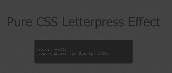
A great example of text-shadow is the Letterpress Effect
Sample Code
[css]h2 {
color: #222; text-shadow: 0px 2px 3px #555;
}
[/css]
Or roll your own with this awesome tool.
Border Radius
One of the best CSS3 properties yet, removing the need of countless images and divs to create rounded corners, now it’s a simple matter of a few CSS lines.
Sample Code
[css]#box { -webkit-border-radius: 10px; }
#box { -moz-border-radius: 10px; }[/css]
The above code gives you a rounded corner div in Firefox, Safari and Chrome, that simple it is.
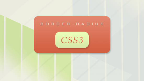
Source: Learn all about the different implementations of border radius.
Box Shadow
I have found box-shadow most useful for images, for years already it has been popular to style your images with white padding and a gray border, while for the shadow effect several images where needed. Now you can easily add shadows with CSS.
Instead of using it as hover effect you can just use it on the image. You can almost never go wrong with this CSS style for images on your website.
Sampe Code
[css].imagedropshadow {
padding: 5px;
border: solid 1px #EFEFEF;
border: solid 1px #CCC;
-moz-box-shadow: 1px 1px 5px #999;
-webkit-box-shadow: 1px 1px 5px #999;
box-shadow: 1px 1px 5px #999;
}[/css]
CSS3 box-shadow and image hover effects
Bonus tip
Here you can find an IE-CSS3 script to add CSS3 support for the most popular CSS3 techniques in Internet Explorer.
