Check out how these designs brought printed books to life online on this week’s Friday Focus.
Designs of the Week
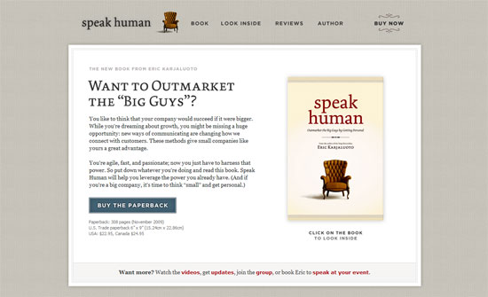
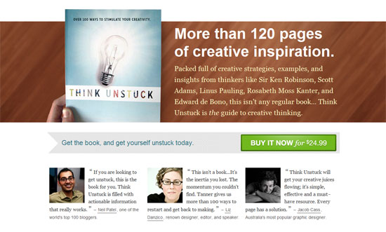
Love the chair illustration on the book appearing in the header. It’s also a good idea to include faces of the people giving testimonials and to make sure they look great in those pictures.
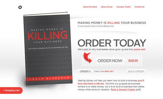
The Order Now button is a little too light to be the focal point of this page, even if the red arrow should draw your eye to it. I do like the subtlety of the gradients though. Also, the book could be a little higher; it looks like the logo is missing in the top left area.
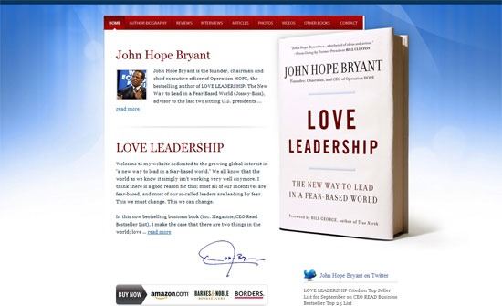
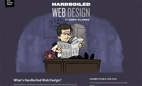
The background effect feels a little dated (Mac OS X wallpaper) although I think the vivid colors work well.
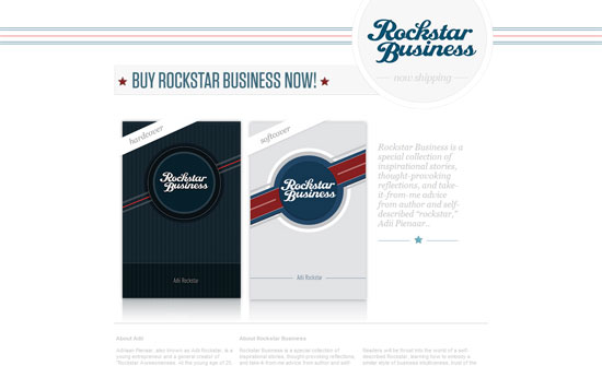
It’s interesting to find the logo at the top right instead of the usual left, or even center. The teasers at the bottom is a great idea although I would have preferred them to appear higher on the page.
The design feels a little generic considering the subject of the book. I like the big bold text and intro though, as well as the bright Buy Now button.
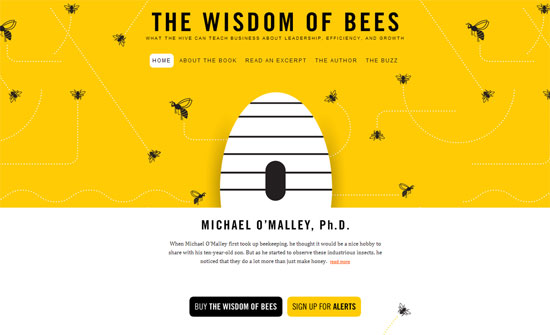
You don’t have to put a literal image of the book on the website, you can integrate the book cover design like this, even add a touch of animation.
All I have to say is: CSS animations and SVG for the win!
Social Media Weekly
Accessibility – The accesskey attribute – do we still need it?
“The accesskey’s uptake within web development has been almost non-existent for three main reasons; differing shortcut values, browser and screenreader conflicts and discoverability.”
HTML5 – Facebook: Using HTML5 Today
“We are excited about HTML5 and wanted to share with you some of the things we’re already using it for!”
