Many of you probably heard of the Weblog Tools Collection’s recent Essay Contest that was started a while back. Our very own Ronald (Ronalfy) entered his article on “What Not to Blog About“, and while he did not win, his article was viewed the most times out of any of the entries (5000+ Views on WLTC alone, not to mention its reads here). Congrats to him, and if you missed the article, go read it now!
Archives for February 2007
Best Website Footer Design?
I’ve noticed something going on for a while now. More and more websites are starting to use the footer space to place comments, related posts, categories, tags, and more.
I had a few questions for our readers:
- What do you think about content being placed in the footer?
- What are your favorite footer designs? (Please include links)
If there is enough feedback, we’ll take our favorite footer design and mention it in next week’s Friday Focus.
The Road to the first 100K
For every site owner, you set goals for yourself long before the site launches. Maybe it’s things you’d like to do in general. Maybe you hope to make a set amount of income by a certain point in time. Or maybe you hope to hit traffic goals each month as the site’s popularity increases. For everyone it’s entirely different.
No matter what your goals are, there are certain times when you can finally exhale and say “I’ve made it”. The so called “Milestones”, like when a site goes live, or gets out of it’s “testing” phase and opens its doors to the public.
This story is different. This is a story about the long and tedious task of hitting your first 100K in unique visitors – a pivotal point in any sites history, be it present and future. Before we begin with the story of Devlounge’s journey to 100k, it’s important to understand what it’s like to manage a large-scale site, especially if you’ve never managed any kind of site other than a portfolio or a blog. Bigger sites are very different.
On a standard personal blog or portfolio, bringing in 100 unique visitors a day would be considered fairly decent, because there is not much backbone behind simple blogs and portfolios. When I used to run a blog on Astereo, I’d be happy to see 60 uniques each day. I thought it was great, but I had never experienced the traffic patterns that were eventually to come with a site like Devlounge.
9 Months in the Making
Oddly enough, despite what the above header might suggest, reaching 100,000 uniques is not like giving birth to a baby at the end of 9 long months. But in our case, that’s how much time it took for Devlounge to mature from a “baby” to where it is today. Every site reaches certain traffic milestones at different points. Some quicker, and some slower, but if the site is good enough, it will happen.
Devlounge reached 100K will little advertising, something I’ve promised to step up for 2007 to get us our next 100K in [hopefully] half the time. Instead, most of our traffic came form word of mouth, kind people linking us, and returnees coming back day in and day out to see what was new. Throughout the 9 months it took us to get here, I watched traffic patterns carefully, noticing where and when people were coming, and what they were doing once they got here.
Traffic Patterns and Patience Pays Off
So many people have such little patience that they lose fate that their own site(s) will be able to hit such goals as 100K. It’s important to never lose sight of these things, because you can reach them, but it might just take some time. We never found ourselves on the digg homepage, or in magazines. But patience paid off.

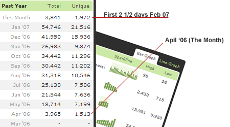
Looking at our traffic logs, if you had asked me back in April 2006 if Devlounge would ever hit 100,000 unique visitors, I probably would have laughed and said, “Not for a long [explicit] time.” In the two and half days of February that have gone by so far, DL has passed the traffic for that whole launch month of April ’06. Talk about a turn around. If I didn’t have patience and didn’t give DL a chance to succeed, I probably would have sold it off back in May. Instead, a hung in their and let things play out first.
Once you get there, then what
After passing that first 100K mark, the next 100K is much easier to get to, and it just gets easier and easier after that to hit new traffic goals. Just imagine 100,000 people from all around the world knowing the name of your site, and telling their friends, who tell their friends, and in turn, your stats show improvements, in half the time as the first time around.
So in the end, don’t let distractions and impatience get in your way. Give you site or startup a chance to grow, because for most of us, it doesn’t happen overnight. But when it does happen, it’ll give you a feeling inside of nailing one of your goals you set a long time ago, and it’s a good one.
100K Day – Refer-a-thon
To mark our 100K unique visitor day, we’re throwing a Refer-A-Thon, and giving one of you the chance to win something cool. What is that exactly? We’re unsure at the moment, as I’m still trying to decide exactly what it will be, but it will be worth it. Besides the prize that’s still TBD at the moment, you’ll also rack in a month of advertising in the sidebar here at Devlounge, either in the form of a banner or text link ad (your call). So yes, we’re giving back to you for your increased traffic and the new readers you’ll hopefully bring to the site.
How’s this going to work? We’ll be monitoring referrers for the next 24 hours via Mint. We’ll then go over all the stats from 12AM this morning to 11:59PM tonight and see which site sent the most people here. Write a review about, email your friends, whatever – just get the word out whatever way you can.
Stop wasting time and get referring!
Style Your Feeds With WP Feed Styler v1.0

Feed Styler is a WordPress plugin for WordPress users who are comfortable with CSS and would like to be able to style their feeds. Feed Styler enables you to keep your existing class and ID style declarations in your content, but allows a different style to be applied to the feed of that same content. No longer do feeds have to be stripped of style and color.
To download Feed Styler, please go to the Feed Styler plugin page.
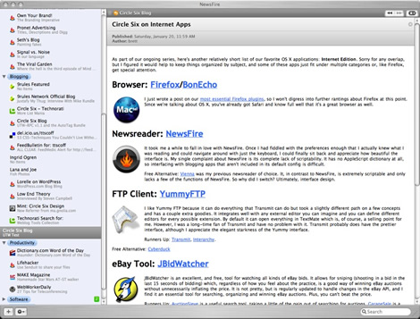
Here’s a screenshot
Brett Terpstra from Circle Six Design provided a screenshot that demonstrates what Feed Styler can do.
A little background
I was skimming through several posts in my feed reader when something caught my eye: an image was aligned correctly. As simple as aligning an image is, I had never considered what my blog posts actually looked like in a feed reader. I quickly added my blog into the reader and was ashamed. The images/text combination was horrid.
After a quick investigation, I came to the conclusion that in order to make images show up correctly in feeds, inline attributes must be used. In order to get images to show up correctly, the code had attributes such as width, height, and align. To my dismay, the code also had deprecated attributes (if using XHTML 1.0 Strict) such as vspace and hspace.
To solve the problem of deprecated tags and such, I began adding inline styles to my images. They showed up great. But I now had a new problem. What if I wanted to change the appearance of all my images? Furthermore, what if I wanted to change the appearance of something other than images in my feed? I could add inline styles to all my elements, but that negates any benefit that style sheets have to offer (and would make printer-friendly pages a pain).
I thought to myself that there must be a way to be able to generically label an element (with a class, or id name) and still be able to specify inline styles for a feed.
Try it out for yourself
Head over to the Feed Styler plugin page and try it for yourself. You’ll find all of the documentation there as well.


