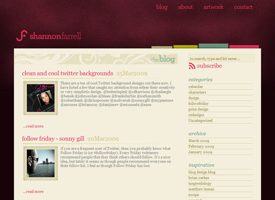
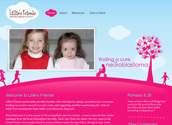
The use of pink in this week’s featured sites greatly differ from one another. Welcome to a pink edition of Friday Focus!
Designs of the Week
I love how this whole page is filled with pink, and everything’s neatly arranged in grids. The sharp (as opposed to soft) page curls on the right-side boxes are a nice little touch too.
There is far less pink in here compared to the previous site, but it’s still quite memorable as a pink site. I like the light swooshes on the section headers too.
I like that there are hardly any straight lines in this design, but what really caught my eye here is the cloud motif in the fly-out menus. Smart design touch.
Social Media Weekly
Design – 8 Simple Ways to Improve Typography In Your Designs
Programming – 10 Cool Things We’ll Be Able To Do Once IE6 Is Dead


