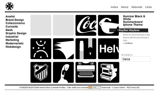
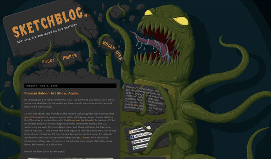
Two very different designs but with one common thread. What’s the moral of this week’s Friday Focus?
Designs of the Week
I like that icons were used to represent the posts. More importantly, that the use of icons wasn’t just an afterthought. They comprise more than half of the “look” of the front page, which means it’s the content of the website that dictates the design. (By the way, they released an icon set for the iPhone with the same black-and-white style!)
I just love how the top navigation links, the welcome blurb, and the feed/bookmark chicklets are being thrashed by the green monster. As you scroll further below it gets less exciting, but what the heck. First impressions last, right? Maybe, but the abundance of artworks is key here. Don’t stop with the blog posts. Give the audience as much as you can. A good design is nothing without great content, so let them consume it!
Social Media Weekly
Programming – CSS Homer Animated
This is the animated demo of how Roman Cortes drew Homer Simpson with CSS. This has been around for a couple of weeks now, so you might have seen it already. If not, make sure you do or you’ll miss one of the best CSS projects ever made.
Progamming – CSS Qualified Selectors
Very, very, useful. I’ve been wishing for this type of CSS selector exactly because of the first example Shaun Inman wrote in this post. He’s asking for feedback, too, so be sure to share your thoughts while you’re there.
Design – Face to Face: An Interview With Nadine Chahine
I rather like this article because it’s rare to find a discussion about foreign type. The challenges of creating beautiful, legible type in a completely different set of characters from the Roman alphabet is just fascinating.
Design – The Untold History of Web 2.0 Fonts Pt. 1
Because we all like to find out what typeface is being used when we come across a famous logo. This list goes a step further and recommends free font alternatives.


