It’s Friday the 13th, so let’s celebrate this eerie date with some dark designs.
Designs of the Week
Web design guru Dave Shea is behind this redesign (it’s his company, after all) that’s turning heads. Excellent effects using jQuery, and that accent image in the welcome blurb is reminiscent of 31three.
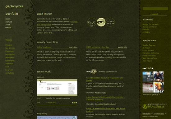
From brown to green, another textured design. This one’s a hybrid portfolio site since it incorporates blog posts and social media widgets, namely, ma.gnolia and Flickr. Brownie points for a 100% fluid layout!
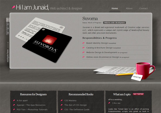
Love the use of depth here, as well as the trusty jQuery for switching between featured portfolio works. It’s gray but it’s not boring. That’s hard to pull off.
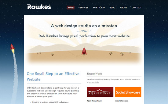
This one’s a little out of place since it’s not dark enough and uses a drastically different color scheme, but this is a popular design this week. The footer, although not shown here, also gives the illusion of depth.
Social Media Weekly
Design – 10 Hollywood Designers To Watch Out For
Whether or not you think Hollywood films are crap, the worlds they have created just blow the mind and should be more than enough inspiration for you.
Programming – 10 SEO Rules for Designers
Even if you’re a designer, it’s important to know even just a little about related skills. Knowing SEO adds value to your work as it helps your clients become more findable online.
Programming – jQuery UI – ThemeRoller
Generate a consistent look for your webapp interface by choosing style and color options, then downloading the theme.


