We have a bunch of metaphorical designs on Friday Focus this week: sites whose looks you can immediately tie to the product or purpose they’re “selling”.
Designs of the Week
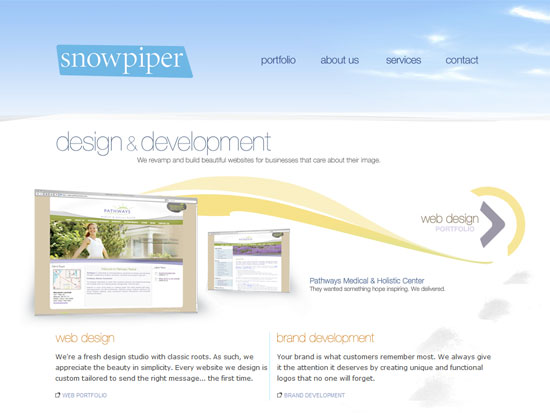
It really isn’t obvious that we’re talking about snow here—until we see the foot tracks. I also like that the clouds are wispy; it’s a very minute detail that still reinforces the cleanliness and lightness this site is going for.
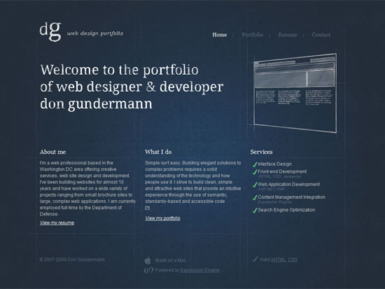
Very subtle execution of that blueprint look. Combined with that textured penciled-in feel. It doesn’t look too tech-y, though. It looks clean and professional.
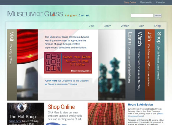
This has probably the most subtle metaphor of all. You can barely get a glassy feel from that box. But I also added this site to the mix for its thoughtful layout and elegant effects.
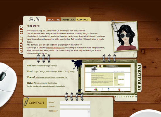
Of course, when it comes to portfolios, many go the tried and tested route of duplicating office stationery digitally. But now matter how many people have done so, no two websites look alike.
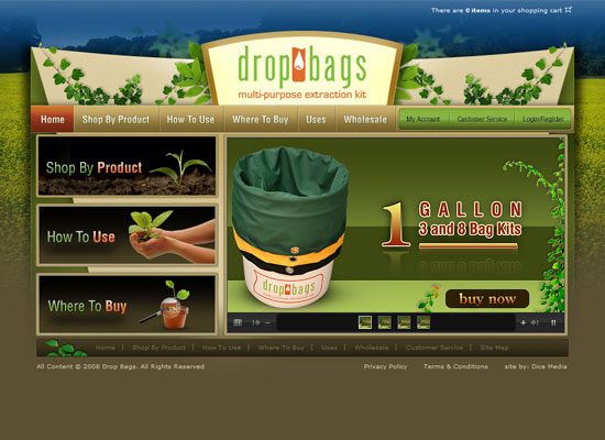
Again, another “expected” route: a nature-driven look for a gardening product website. I do like that there is a burst of blue that strikes a balance with the greenery.
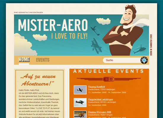
Here’s another revelation. A website for airplane lovers that with a retro feel. I love colors, the subtle texture, and most especially that “winged” icon.
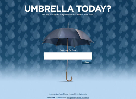
This site is just brilliantly executed. Between the parallax effect of the two layers of raindrops and that single umbrella found dead center of the page, you really don’t need much else!
Social Media Weekly
Design – Top 7 Most Overused Techniques & Elements Used In Graphic Design
The key to fighting excess is moderation. But first, find out which techniques and elements you might be abusing.
Programming – 10 Principles of the PHP Masters
Programming is not just about coding away all day and night. It’s also about finding the best approach to solve a particular problem. Get expert advice here.
