Giant imagery is this week’s theme on Friday Focus. Happy October everyone!
Designs of the Week
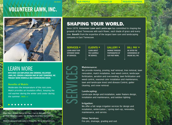
I like the boxy/modular look of this site. I especially like that the huge background image shows what the company is all about, which is landscaping Knoxville and surrounding areas.
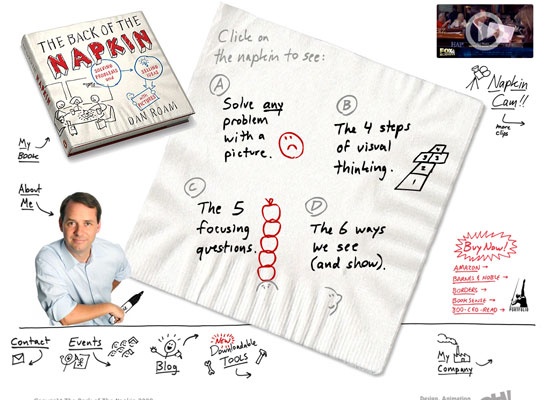
Again, the look of the site strongly reinforces its subject with the napkin and the handwritten effect. But this time, the layout is non-linear. Minus points for using Comic Sans MS in the testimonials section though!
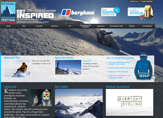
You don’t have to make your background image appear throughout the length of your site. For the more meaty content, this page uses a solid background color. Then you end up at the footer with jagged borders evocative of the mountain slopes.
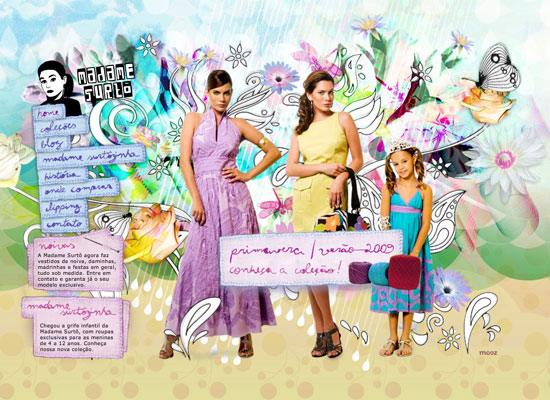
Great mix of all things floral, textured, and hand-drawn. But the design detail I like the most is the sewn patch look.
Social Media Weekly
Design – Forget the Wireframes, Throw Away Your Boxy Layouts — Design BIG!
The title speaks for itself. A guide to thinking out of the box and designing BIG!
Programming – CSS Systems for writing maintainable CSS
A presentation by Natalie Downe about “CSS Systems”, a “top-down approach to architecting a site’s CSS”.


