• Home
  • About
  • Contact
  • Advertise

Devlounge

Design, Develop, and Grow

ateşli sevgilisi fantezisini yaşamak istediğini söyler porno ona arkadaşları varken onunla gizli saklı seks yapmak istediğini sikiş söyleyen kız hafta sonu için gelen arkadaşının görmediği bir sikiş açıdan sakso çekmeye başlayınca adamın yarağını bu altyazılı porno şekilde indiremez ve açık şekilde salonda sikişimeye sex izle başladıklarında misafir kızı da bu sekslerine rokettube konuk ederler seks yapacağını düşünmeyerek onun sex izle oyun oynadığını zanneder sabah olur ve herkes uyanır hd porno bu sırada yanında şişme mankenini de getiren sapık erotik hikayeler genç sınav haftası ders çalışan genç adam üvey annesinin sikiş eve gelmesiyle hayatının şokunu yaşar

  • Home
  • Code
  • Design
  • Design Focus
  • Interviews
  • Publishing
  • Strategy
  • Webapps
  • Extras

Sites Without Menus: Do You Really Need a Main Nav?

March 16, 2009 By Dustin Boston

Is Navigation Useful? Jakob Nielsen posed that question in an Alertbox article from 2000. He came to the conclusion that “users look straight at the content and ignore the navigation areas.” In essence, navigation is not as important as most designers make it out to be.

That was a major paradigm shift for me. I always thought that the main navigation would be one of the most important elements of a website. I couldn’t believe it, so I set off to look for minimalist websites that didn’t use navigation. Sure enough, I found plenty.

Thanks to reader Leon Paternoster who got me started down this path. After a flurry of emails and a couple of all nighters I even redesigned my own site (now with less, less, LESS!). Of course I had to purge nearly 600 posts and change platforms, but I would guess that you could go sans-menu with much less effort.

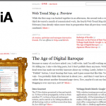
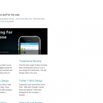
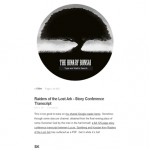
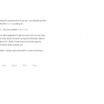
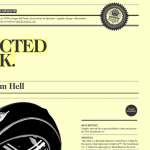
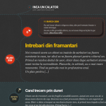
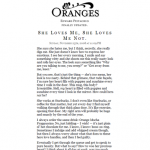
Screenshots and commentary

Click a thumbnail to view a larger screenshot and additional commentary. Links below.

The company website of iA
The personal blog of Daniel Saxil-Nielsen
The online journal of Michael Heilemann
Single-post-per-page personal website
Personal Portfolio of Marius Roosendaal
Digital Web Portfolio of Brett Nyquist
An art direction and graphic design portfolio
The personal blog of Garrett Murray includes everything you’d expect
Plain and simple without being plain and simple
This site communicates a lot of information in a beautiful way.
This business website puts all the relevant information up front
80/20 makes a big impression with very little
Landing page for the Designing for the Web book.
The portfolio site of freelance graphic designer Jamie Gregory
Fresh Squeezed Stories By Edward Pistachio

Visit the sites

  • Oranges
  • Information Architects
  • dtsn
  • The Binary Bonsai
  • Absenter
  • Marius Roosendaal
  • Brett Nyquist
  • Serial Cut
  • Maniacal Rage
  • Inca Un Calator
  • Seed Conference
  • Ch/ma Inc.
  • 80/20
  • Five Simple Steps
  • Jamie Gregory
  • Filed Under: Design Tagged With: minimalism, navigation, usability

    Code & Tutorials

    Which Front-End Development Languages Will Grow in 2017?

    Your Guide to Leveraging APIs as a Developer

    Bitcoin Processing Website Integration For Web Developers

    Website Security For 2016 That All Developers Need To Know

    5 Reasons You Need to Be Using jQuery

    About Devlounge

    Want to read more about Devlounge, or maybe you want to contact us, or even advertise? Oh, and don't forget to subscribe to updates!

    The Best of Devlounge

    Sass x Class = Lea Alcantara

    Search