• Home
  • About
  • Contact
  • Advertise

Devlounge

Design, Develop, and Grow

ateşli sevgilisi fantezisini yaşamak istediğini söyler porno ona arkadaşları varken onunla gizli saklı seks yapmak istediğini sikiş söyleyen kız hafta sonu için gelen arkadaşının görmediği bir sikiş açıdan sakso çekmeye başlayınca adamın yarağını bu altyazılı porno şekilde indiremez ve açık şekilde salonda sikişimeye sex izle başladıklarında misafir kızı da bu sekslerine rokettube konuk ederler seks yapacağını düşünmeyerek onun sex izle oyun oynadığını zanneder sabah olur ve herkes uyanır hd porno bu sırada yanında şişme mankenini de getiren sapık erotik hikayeler genç sınav haftası ders çalışan genç adam üvey annesinin sikiş eve gelmesiyle hayatının şokunu yaşar

  • Home
  • Code
  • Design
  • Design Focus
  • Interviews
  • Publishing
  • Strategy
  • Webapps
  • Extras

Design Focus: Coral, Sunset, Bittersweet

March 29, 2013 By Sophia Lucero

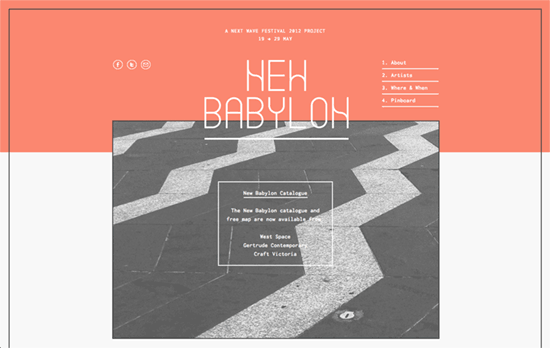
A certain shade of orange is huge these days, almost as huge as and goes hand in hand with the flat design trend. Less of the zesty citrus, more of the corals and roses in what appears to be an extension of the warm, handcrafted feel, while still being bright enough to catch your attention.

Designs of the Week

Want your site to be as good-looking and inspirational as these? Start by choosing a well-designed theme from ThemeForest.

Etch
Etch

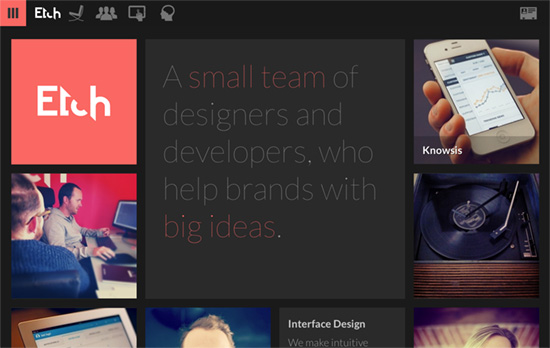
Responsive bento/masonry-style layout, beautiful photographs, and the thinnest Lato for headlines on a dark, moody canvas.

New Babylon
New Babylon

This border and layering look looks very familiar.

Intercom
Intercom

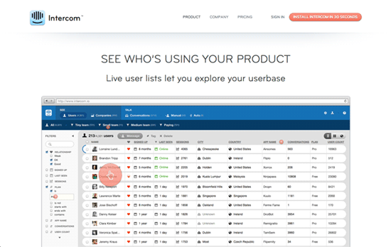
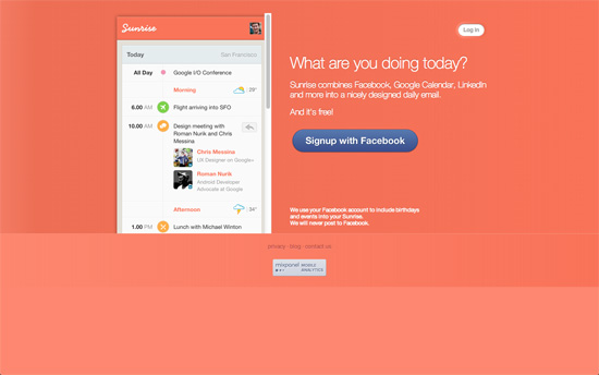
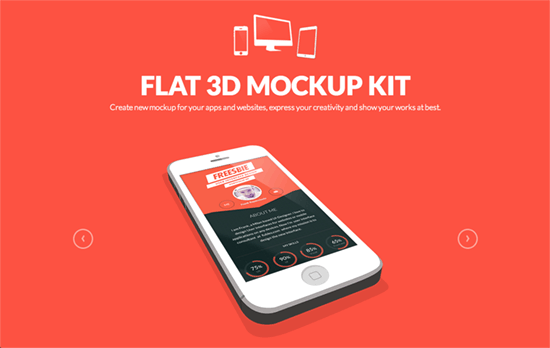
Wonderful to see how a product works straight up, just start clicking away on the guide circles.

Atelier
Atelier

Pairing this color with a bright blue appears to be a thing too. This site goes even further with a busy background pattern. We’ve seen the diagonal lines and folds before too.

Saus
Saus

Some parallax with a twist – the top left and right photos are actually moving pictures. Portfolio items presented as real objects in the next screen.

Moving Things
Moving Things

Animated logo in the midst of some pretty illustrations, breaking apart as you move down. Scroll down to see the rest of the animations.

Caava Design
Caava Design

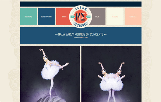
There’s a cool little effect with the diagonal arrow and some wavy patterns that move shoot down or up to highlight the section headings as you browse down. Pretty much all of the text, set in Futura, is in coral, if not tan, which gives a print publication feel.

Minimal Monkey
Minimal Monkey

I’m liking the “brochures laid out side by side” look to this site, with some subtle transitions when you hover. Also, keyboard navigation is always a great feature.

Cirq
Cirq

This one also looks completely like a vintage printed poster that somehow landed in your browser window, but when your mouse moves over that large title, the shadow shifts position. I only wish these were all true text with webfonts, and maybe someday, textures using web filters.

Sunrise
Sunrise

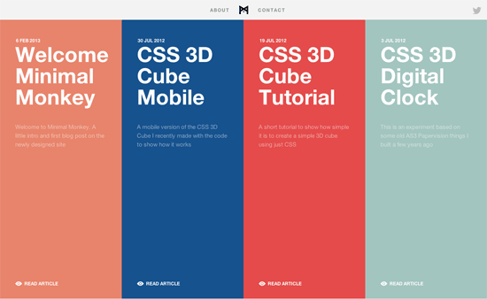
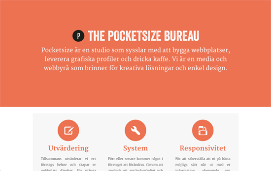
Interesting choice not to use a gradient but solid strips of color in the background.

Buffalo
Buffalo

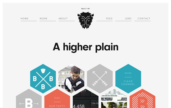
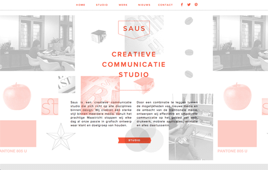
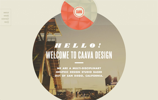
A happy mix of aqua, orange, and gray, not to mention shapes like hexagons and circles.

Jason Designed Me
Jason Designed Me

Posts are color coded by category, and the images are either full-width or half-width in a responsive layout. I find it very interesting how the work and the site palette seem to mix perfectly well with each other, but perhaps that’s because the designer made both.

The Pocketsize Bureau

Super simple look with the content below the fold covering the top part. Clicking on an image expands a dark area with description of the work, a style Google Images employs these days.

Flat + 3D Mockup Kit

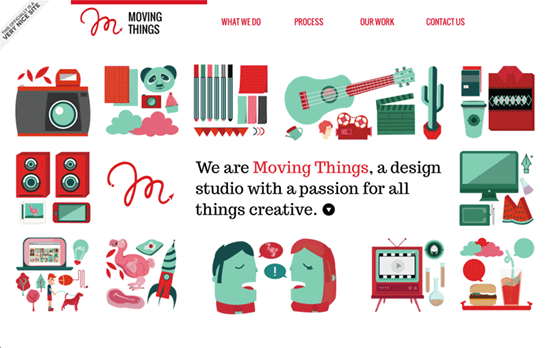
White and black illustrations on a orange background = compelling look.

Fontastic
Fontastic

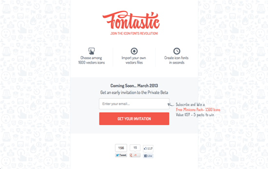
A little odd for an icon fonts site to be using images for the icons, but okay.

Sidebar
Sidebar

I like that this veers a little to the left instead of center.

Matt Delbridge
Matt Delbridge

It’s cool combine your portfolio into a slideshow, header, and logo background at once.

Social Media Weekly

Get solid WordPress themes, plugins, and web design training from iThemes.

Web Design – Material Honesty on the Web
“So, contrary to what the detractors say—there is a place for decoration, and a place for material honesty. These two exist on a continuum, with decoration at one end and material honesty at the other. There’s no precise point at which a design becomes honest or dishonest. The web designer has the messy job of sorting it out.”

Design – Learning to See
“Learning to design is learning to see, an adventure that gets more and more captivating the further you go.”

Typography – Introducing Adobe Blank
“Invoking this font, as a temporary measure, prevents OS- or application-level font-fallback from kicking in before the intended font can be rendered.”

User Experience – Don’t Be Afraid To Teach Interactions.
“Don’t stifle innovation and interesting gestures. Explain them, and people will remember.”

Design – The Myth of Perfect
“While we take much pride in the craft of our professions, it causes a level of anxiety similar to what many of us feel on stage while hundreds of pairs of eyes are staring at us.”

Friday Focus 07/30/10: Centered Seals

July 30, 2010 By Sophia Lucero

Sites usually place logos at the top left corner of the page, but nudge them to the center and it makes quite an impact, as a red wax seal does on a white letter envelope. Let’s check out sites with centered logos on this week’s Friday Focus.

Designs of the Week

Min Tran's Journal

Love all the patterns and pastels.

Catered By Kate

Nice torn effect on the navigation and echoed throughout the rest of the site. I also like the subtle adjectives in the background.

G2 Geogeske

There’s some weird layering going on when you scroll up and down, but I like the impact of this look.

Word Refuge

The text length in the inner pages is too wide, and the script feels a bit much. Still, I like the textures and the old style illustrations.

Le 28Thiers

I like the curved header navigation coupled with an ornate background pattern. The boxes of text are nicely framed, and the buttons are equally elegant.

Barley's Greenville

Interesting idea to put all the beer labels as a collage for the header. There’s also a bit of a split design going on, and the use of curly braces as arrows.

Ośrodek Wypoczynkowy Zielona

Not-too-distracting animations above the logo in the footer, and not-too-overwhelming use of wood including menu items and buttons.

New Hampshire Distributors

I find the “featuring” slideshow highly effective. The use of red, on the other hand, may need more tints and shades. What I really like is the glowing hover effect especially in the three boxes below the slideshow—simple idea but it works.

Steinway & Sons

Two things that grab me: seamlessly elegant carousel of featured pianos, and the use of piano strings in the background as a stylized sunburst effect.

Usable Efficiency

I wish for a little more polish on the RSS and collapse/expand buttons, but I like the openness of this layout.

Clover Cottage

It’s great that the wood texture isn’t your typical bright brown but one that actually fits the theme of the site. The form elements in the booking box is excellent.

Six11Ink

I really love the stylized buttons in the header navigation, and I wish it were applied to every other button on the site. Old style illustrations also used here, but what’s great with this site is that it explains (in a collapsible area) what the they symbolize.

Sky's Guide Service

I think the wood could be a little lighter to distinguish the red on the logo, but overall this site has an excellent design from typography to illustrations to form elements.

The Eagle Rock Yacht Club

Using a wave pattern as divider is both whimsical and smart. I love the splashy sea photograph background in the footer navigation.

Paul Bennett

Subtly textured, clean, yet feels perky.

Cloudania

Nice gradient on the main blurb, which breaks the blockiness of the text and gives an ethereal effect. The floating folded paper background on the video, which is an echo from the logo, is a nice touch too.

Social Media Weekly

Accessibility – Ten Common Accessibility Problems
“This document outlines ten common accessibility issues I have encountered which could result in a site’s failure to fully comply with WCAG 2.0. The document includes links to some of the WCAG 2 advisory Sufficient Techniques provided by the W3C for addressing each issue.”

Design – Create Stunning 3D Text Free With SketchUp
“Today I’ll teach you how to create some awesome 3D text using only Photoshop and a free app from Google.”

Design – Tips for Designing for Colorblind Users
“We’ll take a look at what colorblindness really means and how you can tweak your designs based on a few simple principles.”

CSS – Start Experimenting With CSS3 Keyframe Animations
“For this reason they’re used sparingly, in a lot of cases for experimental purposes or as ‘hidden gems’, but that doesn’t mean you should shy away from getting stuck in.”

Programming –

Friday Focus 03/26/10: Full Bloom

March 26, 2010 By Sophia Lucero

Let’s celebrate the new season with stunning designs that display the best nature has to offer. Happy Friday Focus!

Designs of the Week

ktgardens.cz - příběh vaší zahrady

Wonderful design. The hover effects are brilliant. I also like how the layout is open and flowing. Both the photographs and the inner page designs are full of personality.

Modstudio

The integration of nature here is simple and limited but the effect is still eye-catching.

Solace Beeswax Candles

I can’t stop looking at this site. The art is topnotch. It’s warm and relaxing but still a strong color palette; I want to put it on my desktop or hang it on my wall. The animated candles are a nice, subtle touch.

Visualwild.com :: Portfolio for James Ricks

Despite its darkness, the has the same effect on me as the previous one—the design has a great scene that puts you in a certain mood. The typography and other graphic details are also excellent. Tiny gripe: the contact icons and CSS awards could have been blended in better.

Arvorecer

Despite some cliche elements (the man with outstretched arms and the glowing tree), there are some great graphic details on this site. My favorite would have to be the borders turned twisting ribbons turned hills, with leaf-like patterns—how do you even describe this? The brown, orange, gold, and green colors blending into one another is just great.

Social Media Weekly

User Experience – Five User Experience Trends I’ll be Watching in 2010
“Today I’m sharing five trends I’ll be watching over the coming year (and beyond) along with some thoughts about how they might change our industry. And even if I’m wrong about some of these, I’ll be interested to see where they go.”

CSS – 11 CSS3 Code Generators to make CSS3 development a breeze
“CSS3 is awesome, but the new syntax is sometimes hard to get your head around. Thankfully though, a few kind souls have created some very useful tools to generate the code for you.”

CSS – A Killer Collection of Global CSS Reset Styles
“I have used each of these resets on various occasions with great success, and have even managed to scrape together a customized hybrid that cannibalizes key aspects of various others. For each reset, I provide as much information as possible concerning the source of the reset, key effects, and other essential information.”

jQuery – jQuery Presentation Plugin: Say NO to Keynote!
“I wrote this small jQuery plugin that gives you an interface in a browser to give a presentation. If you are getting antsy, take a look at a demo or download it from github.”

Design – 7 Steps To A More Effective And Productive Web-Design Process
“The tips and tricks below are my personal experience. It has worked for me and I’ve learned many of them from working with other designers, too. They’re little insights into my own design process. I hope you find it useful.”

Friday Focus 03/19/10: Left-Aligned

March 19, 2010 By Sophia Lucero

Here’s an old-school pattern that hasn’t gone the way of the dodo: left-aligned designs. Symmetry is great, but asymmetry? Even better. Welcome to this week’s Friday Focus!

Designs of the Week

Blue Sky Resumes

Going left-aligned isn’t just about “being different”, sometimes the design really calls for it, like this one does. It also has a fixed area—those two seem to go hand in hand for a lot of sites, don’t they?

Valchan Petrov

Utterly simple formula (photographic background + minimal graphics) but it works!

points n' pixels

This one’s the polar opposite of the previous design: a calmer look, Flash for the photographic background transitions, and custom fonts.

Dustin Walker

Do your users hate long-scrolling pages? Make people love ’em—this site makes it easy with the up/down arrows. I also like that the heading backgrounds match the portfolio color schemes.

Karo Mumkin

Not shown, but I like the treatment of the posts in the lower half. Another example of matching by color (and by icons), and also breaking the boxiness away.

FantasyCreative

I love elegant, subtle designs. Interesting portfolio technique: display nothing but a full-size screenshot of your work for each client page. That way people experience the designs as close to the real thing as possible. Lightboxes and other solutions usually resize down.

Social Media Weekly

Design – Free Icon Search Engine – FindIcons.com

CSS – CSS Font Shorthand Property Cheat Sheet
“I’ve prepared a printable cheat sheet that you can download and hang next to your computer, which will come in handy in case you decide to use this property yourself, or are forced use it in a stylesheet from an inherited project.”

CSS – The Right Frame of Mind: Applying the Lessons of CSS Frameworks
“The purpose of this article isn’t to debate whether or not you should use a framework, but to examine why the need for such solutions exists. We’ll take the processes used (and lessons learned) in their creation, and try to show how they can be applied to your own style sheets.”

HTML – HTML5 structure—div, section & article
“These elements are replacements for the common ad-hoc semantics we applied before HTML5 with @class and @id, for example <div class="sidebar"> or <div class="nav">.”

5 Hot Color Combos for the Web

March 16, 2010 By Lorraine

I almost titled this post “5 Hot Color Trends for the Web”, but the truth is that I’ve never really considered myself “trendy”- and I’m not sure if trends are something we designers should give much importance to. With design- especially web design- we want to innovate, whether it’s a new spin on a vintage look or a modern design sitting on the cutting-est of edges.

If, like me, you spend an inordinately large amount of time over at COLOURlovers, you’ve probably seen some of these color palettes, which I’ve chosen as my current favorites, color combos that give me inspiration. Let’s hope they do the same for you:

Golden Yellow Sunset

I love finding inspiration in objects handmade from natural materials. This color combination is based on a necklace at Etsy made of Amber and Citrine chips and freshwater pearls. A lovely, light and summery color palette.

Dive Into Color

Everyone likes to talk about “embracing color” in design- but the truth is, putting a variety of colors together without coming up with something garish or circusy can be difficult. This combo, inspired by a room on HGTV is colorful in a comfortable way.

Kimberley and Luke

My husband and I designed (and printed!) our own wedding invitations ten years ago, and it’s always great to see other designer couples get creative. This color combination from Kimberley and Luke’s wedding invitation was obviously well thought-out, where “JCrew meets Pomegranate meets Tiffany’s”. Gorgeous.

Lubitel

If you haven’t discovered the Wear Palettes website yet, go. It’s one of my favorite bookmarks, offering up inspiration in way of street fashion, celebrity style, and plants. This one, based on the ultra-simple “jeans, jacket, scarf, gloves”, is a lovely neutral color combination.

Superawesome

Anyone who knows my work knows I have a penchant for muted, monochromatic color combos. I’m not proud of this, and am always struggling to incorporate brighter hues into my designs. Superawesome’s use of bright colors is simple yet genius- it doesn’t blind you, but it does make you feel good. And isn’t that what color is all about?

Where do you find color inspiration?

Next Page »

Code & Tutorials

Which Front-End Development Languages Will Grow in 2017?

Your Guide to Leveraging APIs as a Developer

Bitcoin Processing Website Integration For Web Developers

Website Security For 2016 That All Developers Need To Know

5 Reasons You Need to Be Using jQuery

About Devlounge

Want to read more about Devlounge, or maybe you want to contact us, or even advertise? Oh, and don't forget to subscribe to updates!

The Best of Devlounge

Larissa Meek

Search