Circular motifs are very much alive these days, and your site will stand out even more when used as a navigational interface.
Designs of the Week
Search Optimized, Turn-Key Designs, Unlimited Everything. Start building with the Genesis Framework today.
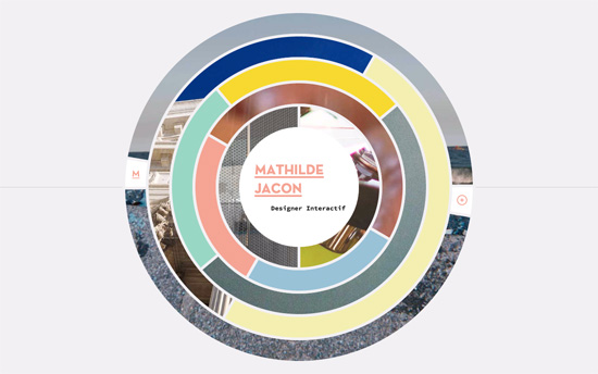
Each concentric circular area with images masked in them lead to pages describing the particular project. On it, the column of website screenshots move quicker than the opposite one containing text. The circular elements continue with a button and arrow that leads to the live site, and a couple others that animate and highlight the currently loading and next/previous pages. On the overlaying list of projects, the circles also pop up as icons beside each name. You’ll enjoy the clever interactions all around.
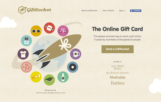
There’s something that feels young about this site, and has this warmth you see a lot less of these days. A textured background, borders and backgrounds that clearly demarcate sections, and a subdued color palette. It’s certainly “flat”, but rounder and kinder around the edges.
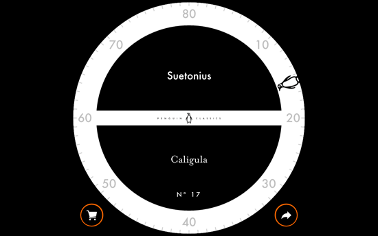
This is essentially a list of books with corresponding quotes, but the way you interact with it via the famous penguin on the circumference of the white sphere, makes all the difference. You can either click on it and have it land on a random book, or drag it around. Clicking on the center area flips the black part to the reveal the quote, and even prompts you with an animation of a tap to do something in case you forget the initial instructions. The auxiliary orange circles bubble up additional ones for shopping and sharing.
Social Media Weekly
Pagelines lets you build WordPress websites and it’s as easy as drag and drop, go check it out!
CSS – How to Center in CSS
Typography – 100 Days of Fonts
Email Design – Email Lab: A Starter Kit for HTML Emails
