Minimalistic design never goes out of style. The design trends used in a design do come and go but minimalistic is timeless. A good example of a popular design trend currently is the dark background with noise, it can be used in all sorts of design and eventually gets out of style.
When you have an interactive website the icons you use are very important, it should be clear what action they represent and in the case of a minimalistic design they should fit seamlessly.
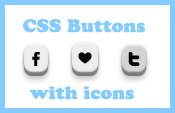
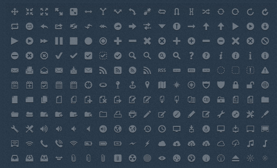
Thanks to CSS3 you can do a lot more with minimalistic one color icons in transparent PNG. On the thumb picture you can see an example of CSS3 buttons using the ‘Default Icon’ 16×16 PNG. By keeping the colors gray in tone with the black icon you can create buttons as easily as adding a class=”button” to your images.
This is just to give you an idea how you can go a bit further then just applying the icons in your website. Most of the icons listed here also have bigger sizes but this selection has the best mini icons out there that fit perfectly in a minimal design.
Default Icon
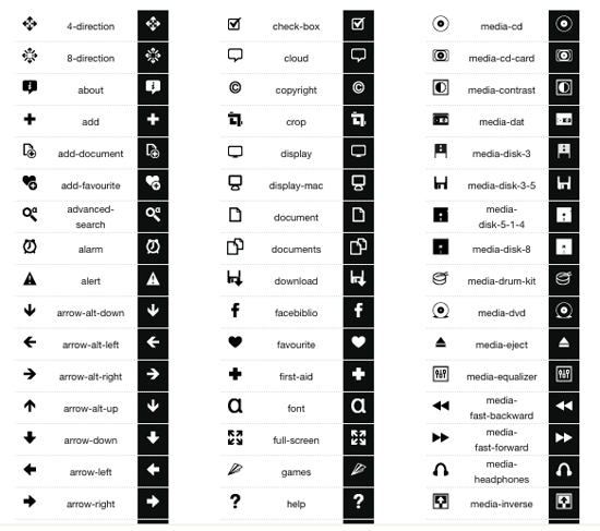
Minimalist Pixel
![]()
Gentleface Toolbar Icons
![]()
Brightmix
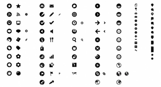
Only2 Icons
![]()
ExplodingBoy Pixel Icons
![]()
Dortmund
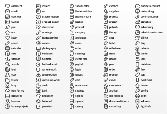
Sanscons
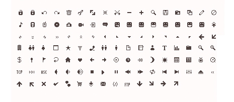
Bitcons

Minimal UI Icons
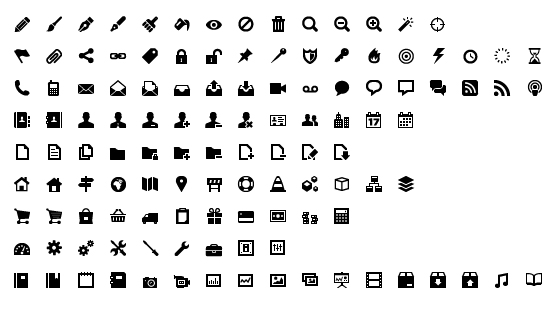
HoHoHo Mini Icons
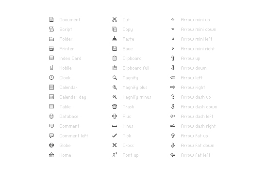
Helveticons
![]()
Premium
Pictos
Premium
