In the world of designing, font choices go hand in hand with the importance of colors. I mean if you can’t read something, what are the chances your going to bother trying? Finding and using the perfect font can vastly alter the appearance of a site – whether it’s grunge or professional, the look can be controlled greatly by just a switch of the text in graphics.
Finding the perfect font is a little bit more of a difficult task, but with thousands of font resources out there (both free and paid), there is no shortage of places to look. Today we’ll focus in on Urbanfonts, a resource I was asked to review recently, and I hadn’t even seen until a few days prior to the request.
Urbanfonts – Free Font Directory
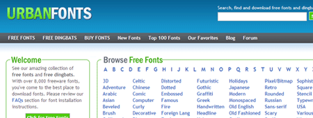
Urbanfonts prides itself as being a “font directory in a web 2.0 style, containing over 8,000 free fonts.” All “web 2.0” design joking aside, UF does use ajax in some key places that can be real time savers.
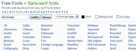
As with most font sites, fonts on UF are sorted into categories based on the type of font they are. Each font can also be assigned tags, to help narrow down your search. Another feature common with most font directories is the ability to enter in your text an get a live preview of the word you entered in on all the font pages. On most sites, this requires an extra click, but UF uses ajax to refresh the font lists with your word as you type. You can also hover over each font example to see what the entire A-Z alphabet looks like for a particular font. Simple time savers like this can become pretty beneficial if you plan on going through pages and pages to find the perfect font.

Much like most free font directories, you can also browse a separate list of premium fonts. These are also broken down by font name (alphabetically) and by categories / type. Other pages include a Top 100 and “Our Favorites”, which I’d assume our picked by the staff.
Other forms of fontness
UF also has a blog with posts about various fonts, for example, the history of Helvetica. They also have a forum that lacks activity, with a very limited amount of posts. The site, in my opinion, is still too new to try and be building a forum community around. Generally, it’s a better idea to get things settled before you attempt to communityize (yes, I know that’s not really a word). We attempted it when Devlounge first started, and we never even reached 20 members.

A Wrap Up
Besides using ajax here and there, UF goes hand in hand with the many other font directories out there. There are no popups, but there are plenty of other ads scattered throughout the page. Collection wise, you’re going to find the same free font collection on UF as you’d find just about anywhere else. Really, UF does not stand out from any other font directory I’ve used. Everyone has their favorites and that one specific site they head to every time, and if UF intends to stand out, they have to do a little bit more in my opinion.

