The following is a paid review for Colourlovers, but at the same time, it is also discusses how CL can help all of us when it comes to making design decisions. As with all our reviews, we are 100% honest and straightforward.
An Intro to what Colourlovers is
First off, I’m not accustomed to spelling “color” with a “ou”, but no matter how you spell it, color/colour is essential to design. In fact, color is essential to just about everything. Without color, the world would be one boring place.
In terms of design, color can dramatically change the look of a site, even if it’s applied to the same layout. For example, dark designs give off a completely different “vibe” than light sites. In some cases, a design could be looked at as “horrible” simply because of color choices, but if different colors were used, it could be award winning.
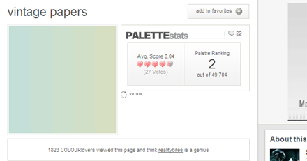
So than there is Colourlovers. CL contains a wide collection of color palettes for you to choose from. Each palette is rated by the users and sorted into different categories based on the palette itself and the colors it contains.
Finding Good Palettes
I know this is something I struggle with every time I go to design something. I really try to stay away for dark colors for the most part, but than I tend to find myself using the same color schemes just with slight variations on multiple site designs. This makes designs seem repetitive, and makes it look like I lack creativity.

I have only used CL once before, nearly two years ago when trying to choose blue hues for an Anti-spyware site/blog I was designing at the time. At that time, CL had a completely different design and wasn’t as easy to navigate as the latest version of the site is. I was successful in finding a good combination of blues, and I went forward with a successful design.
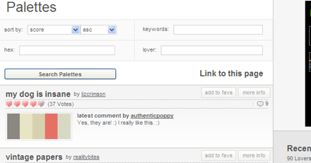
Since my first experience with CL so long ago, the site has been retooled and reorganized, which makes finding palettes a whole lot easier. You can view the top and newest palettes and colors, and sort them accordingly (by rating, name, and date added.) Each palette and color submission can have comments and be rated, which allows you to get a feel of how the audience feels about the colors before you actually give them a try on one of your designs.

Each submission now also contains tags. Right on the CL homepage you can view some of the most popular tags. Tagging colors can really benefit you, for example, if you’re looking for “calming” colors a search is most likely to bring up many light color schemes, while if you were looking for “angry” you would end up with dark color choices.
Find a few, than experiment
The best way to select colors for a design and / or site is to experiment. Don’t just grab one palette, but find a few you like and would consider using. Try to find colors they convey the meaning and purpose of the site or design. Right down the hex codes for the colors in each palette and begin the plug and play process. Almost always you’re not going to get it right on the first try. I constantly find myself tweaking colors up to the last minute. To this day I still tweak colors here on Devlounge, even after the site, and more particularly this design, has been up for months. Color combos can make or break or site, so getting it right is something that takes time, but is worth it in the end.
Beyond Colors
CL also has a few interviews and articles that relate directly to the importance of colors. You can also look at trends which analyzes color choices in print media. This can help determine is something is “hot” or not.
If you are struggling with picking the next best set of colors for an upcoming design, take a few moments to browse through the gallery at Colourlovers. Even if you don’t find exactly the palette you are looking for, it can give you inspiration for your own palette, and push you in the right direction.

