Like the parallax effect, horizontal scrolling is a popular technique to grab people’s attentions and making a website stand out. It also challenges the usual top to bottom browsing we are accustomed to, so it should always be used with caution. Let’s see if this week’s featured designs are on point. Happy Friday Focus!
Designs of the Week
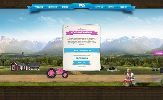
It’s great how before you begin scrolling, when you hover on the “Scroll” button (ribbon actually), the screen goes dark to give you a hint about your scrolling options: it covers all bases from arrow keys, scrollbars, scroll wheel, and even touch. Several vehicles (a pink tractor and boat, a yellow limousine) lead you through different sceneries as different cards in the stack move to the top, each containing descriptions for the current section. Selecting it moves the viewport “up”. The shadow of the floating page is a little too strong, almost looks like a solid border, and the body text could be a little more styled to match all the other elements. One last thing I find weird: the hover color in the navigation is a very strong pink that clashes with the blue ribbon background. Overall though, very pleasant site!
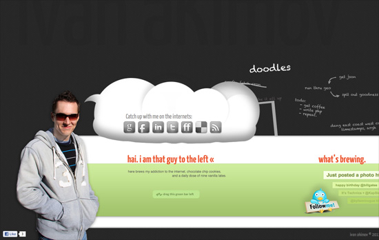
At first I wondered why there was a lot of space at the top then I noticed some very subtle text in the background. Navigation is different from the usual horizontally scrolling sites out there: instead of dragging the scrollbar, you do the dragging action anywhere in the green area. Which isn’t bad at all if you don’t mind inadvertently highlighting elements on the page. I like how the latest tweets are arranged although the social icons seem to have larger emphasis than the rest of the content.
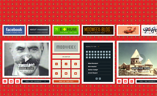
I just wish the background pattern wasn’t so bright so I can enjoy the old school look going on here, between the pixelized fonts and icons. What’s weird, though, is there seems to be no visual hierarchy. The title is mixed with the navigation in between each video, while the About and Blog are displayed alongside the ad-like boxes at the top.
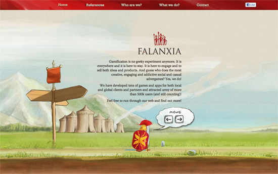
This one captures the platformer video game format with the keyboard navigation, which even accelerates the character (from walking to running) if you press long enough. I also enjoy enjoy the watercolor, storybook-like illustrations on the site.
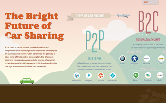
Not only is this a wonderfully animated side-scrolling site, it’s also one long horizontal infographic. It uses both motion and the landscape to take advantage of objects and depict statistics and comparisons through them: flags, trees, houses, you name it.
Social Media Weekly
Responsive Web Design, Mobile Web Design – Multi-Device Web Design: An Evolution
“From responsive Web design to future friendly thinking, here’s how I’ve seen things evolve over the past year and a half.”
Design – Lots of Ipsum
“There is just too many awesome Lorem Ipsum (placeholder) text generators going around lately not to round them up.”
JavaScript – 140byt.es
“140byt.es is a tweet-sized, fork-to-play, community-curated collection of JavaScript”
User Experience – Don’t Give Your Users Shit Work
“We need to get out of this idea that the act of spending time on a project means that you spent your time wisely. Sometimes you’re just wasting your time.”
