Transparency, translucency, opacity: we have designs that are peeking through this week on Friday Focus.
Designs of the Week
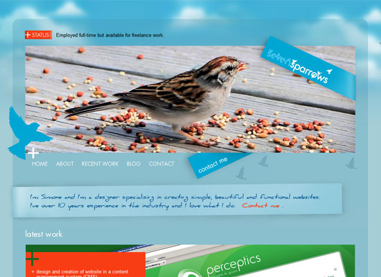
The combination of robin’s egg blue and bird silhouettes is becoming more popular these days—dare I say because of Twitter, but this design is beautiful in its own right. I love the treatment on the hyperlinks, a graphical element also found in the logo, the “contact me” sign, and the handwritten blurb.
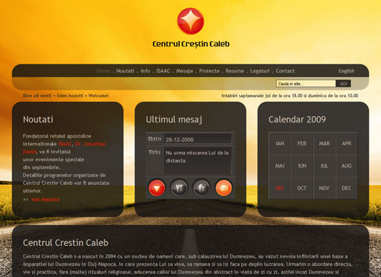
If you’re playing with transparency, why not use a striking background image that’ll show through? I like that the logo is centered at the top, while the background is a one-point perspective shot. Great warm hues, too.
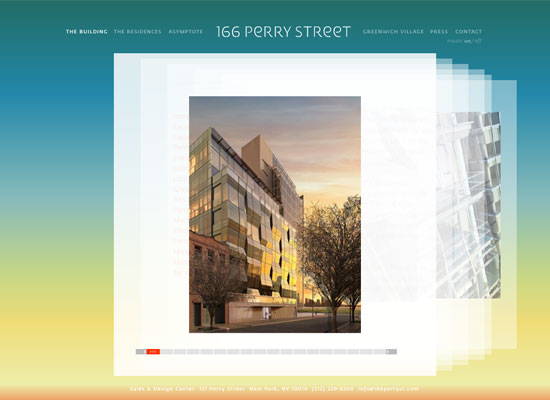
Interesting use of the coverflow effect: instead of scrolling vertically, you’re browsing through a virtual stack of pages. (Not exactly sure why, but it makes for an interesting experience.) The changing background colors are an interesting touch.
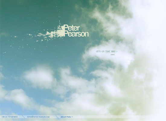
So where’s the use of transparency here? It’s not very obvious, but when you use the javascript scrolling effect by clicking on the arrows, you’ll notice that striped wavy lines seem to fade in and out. Now that’s an interesting use of an overlaying translucent PNG which also doubles as a transition animation as you move from one screen to another. Bravo!
Social Media Weekly
Design – 7 Interface Design Techniques to Simplify and De-clutter Your Interfaces
Because simplicity is always trickier than complexity.
Programming – 7 Fresh and Simple Ways to Test Cross-Browser Compatibility
From screenshots to actual apps, ensure your sites are working to the T with these tools.


