This week’s Friday Focus features designs carrying shades of purple, pink, blue for a look that’s sophisticated, feminine, or both.
Designs of the Week
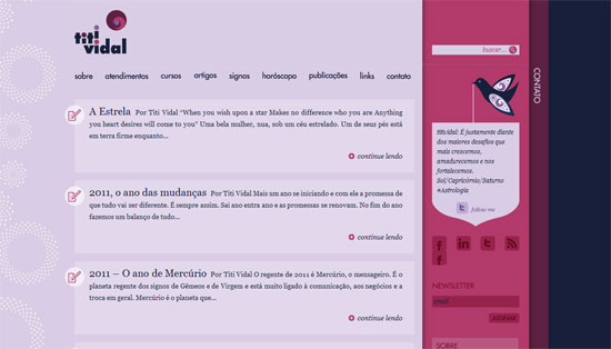
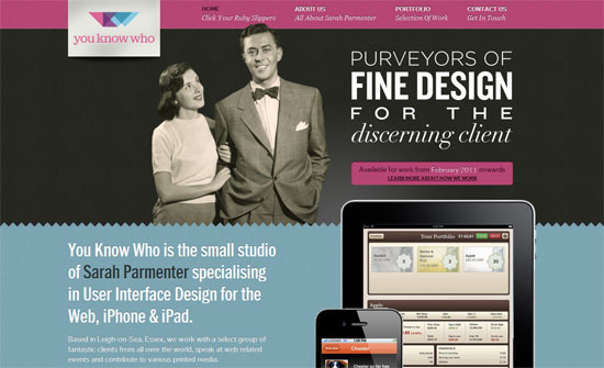
I like the layered look from the main content area to the sidebar to the contact bar. Even the hover effect on the menu is simple yet different. Another smart idea is to repeat the logo in the Twitter bird and have it carry the latest tweet.
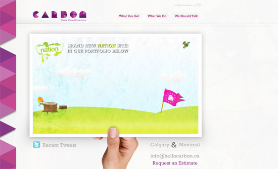
Love the color-changing border on the left. Microcopy such as “We’re Ready” and “We Should Talk” is striking and smart.
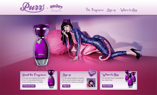
Pretty straightforward site, surprisingly un-flashy, it’s just a shame that the custom fonts are just images.
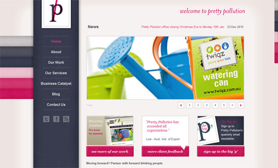
I like the repeating swatches and subtle texture on the buttons, although I wish that what you find in the footer describing the company is shown higher on the page.
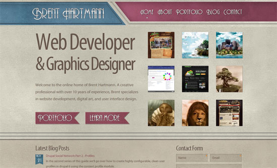
The site looks quite cozy. I was hoping there were more vintage elements integrated.
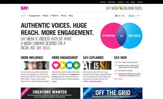
I like the mix of the handwritten and bold uppercase fonts and the basic solid colors used on every page.
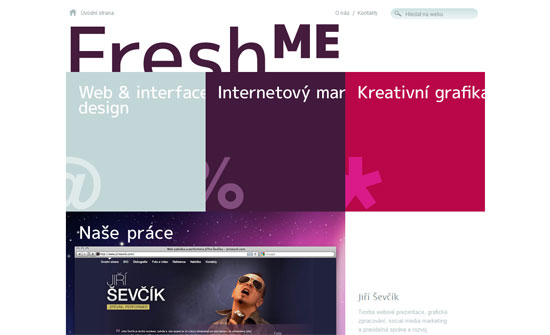
Love the compartment/bento box layout made more interesting with the sliding effects.
The type is the strongest feature on this design, but all the details are interesting.
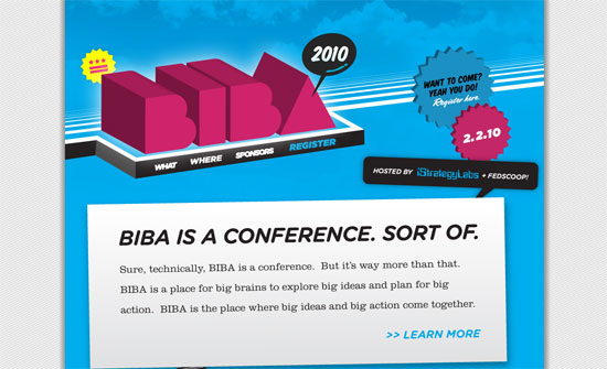
This design is bursting with personality through 3D effects, scrolling animations, and background patterns.
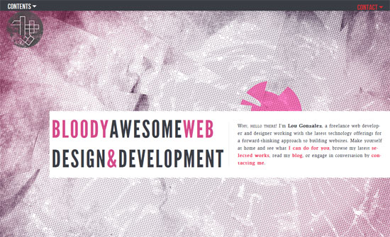
Another bold design, although I want to note two things: the logo blends well with the background but should your brand fade in like that? And does hyphenation on the web really work, because for me it makes things harder to read.
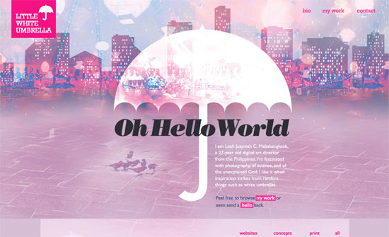
Nice one-page site, and colorizing the portfolio images always work well like that, but there’s a bit of a disconnect between the top image and the next screenful.
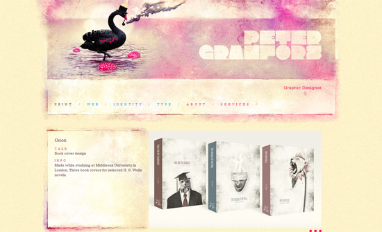
It’s always nice to be able to integrate even a little bit of art into a portfolio layout, whose images inevitably take away from that. Beautiful imagery, textures, and type.
Social Media Weekly
Web Standards – 2010: The Year in Web Standards
“WHAT A YEAR 2010 has been. It was the year HTML5 and CSS3 broke wide; the year the iPad, iPhone, and Android led designers down the contradictory paths of proprietary application design and standards-based mobile web application design—in both cases focused on user needs, simplicity, and new ways of interacting thanks to small screens and touch-sensitive surfaces.”
CSS – Pure CSS3 Post Tags
“This is a rather simple pure CSS trick you can use to style your blog post tags, usually placed at the bottom of the posts.”
CSS – Why use Classes or IDs on the HTML element?
“Reader Nicolas writes in: I’m frequently seeing ID and class specifications to <body> and <html> elements. I’m curious as to why one would do this? If it is unique to either element, then why not specify body or html in the CSS?”
CSS – The CSS3 Resize Property
“The resize property allows a developer to define whether or not a UI element can be resized manually by the user.”
JavaScript – Eloquent JavaScript: A Modern Introduction to Programming
“Eloquent JavaScript is a book providing an introduction to the JavaScript programming language and programming in general. The book exists in two forms. It was originally written and published in digital form, the HTML version of which includes interactive examples and a mechanism for playing with all the example code. This version is released under an open license.”
