This week’s Friday Focus is a little meta: a combination of useful guides and tools geared towards designers and developers all wrapped in inspiring designs.
Designs of the Week
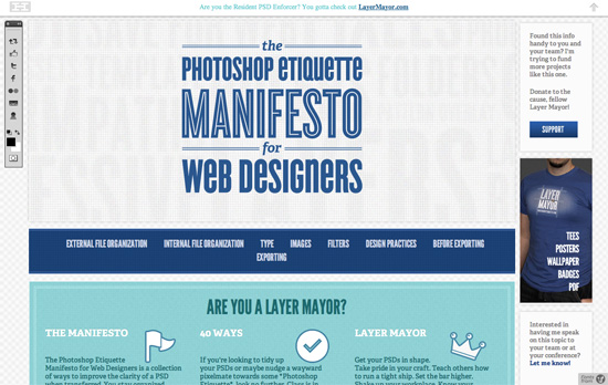
Interface imitation clearly at work here, but note how the famous checkered pattern is blurred a little to make the foreground more readable. Nice integration of share buttons into the “toolbar”.
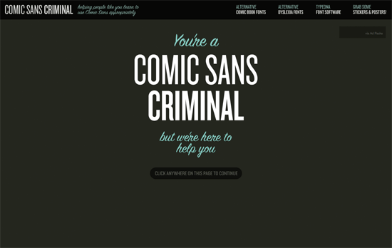
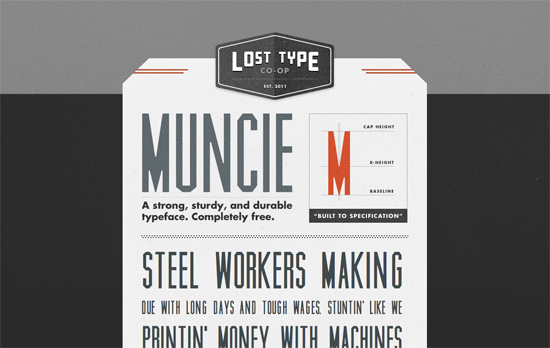
While the site looks elegant and minimal, I’m getting more and more allergic to text typeset in all-caps, narrow fonts as much as I do with ones set in Comic Sans.
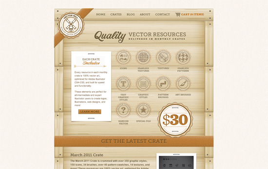
Not a bit of detail left unturned here. Love how the Twitter and Facebook buttons are integrated as stamps on the foot of the crate.
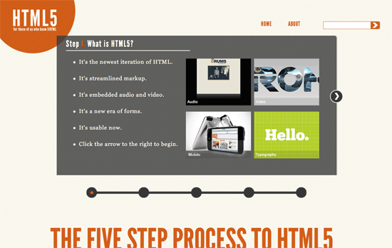
I like the progress bar-style approach to the site, the only thing that feels off is moving a step backward uses the same animation as moving forward.
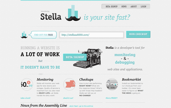
I feel like the vintage touch that’s become popular lately also facilitates wit in copy and other user experience areas. Just look at the logo!
Simple and striking enough; I hope to see more fonts offerings here.
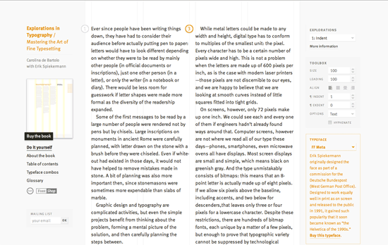
Not only is this site a great tool, but it’s a great idea for promoting the book it’s based on.
I love the combination of the old school watercolor paintings of the countryside combined with fairly modern interface touches.
Social Media Weekly
CSS – Faking float: center with Pseudo Elements
CSS – 39 Ridiculous Things To Do With CSS3 Box Shadows
CSS – CSS3 Patterns Gallery
CSS – Safe CSS Defaults
