This week’s featured designs have great personalities and stand to remain etched in your brain thanks to generous use of illustrations. You’ll definitely want to meet them!
Designs of the Week
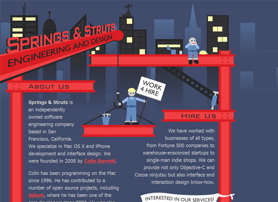
Taking cues from the company’s name and branding, this design is a joy to look at. I can only wish it had more pages so I can see how they can take the construction theme further. I love how the text moves around the design, and not the other way around. Sometimes it’s good for function to follow form, isn’t it?
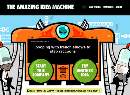
A snarky website deserves an over the top concept, so here you go. Is that Obama on the left and Einstein on the right?
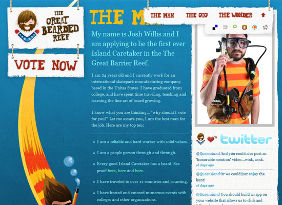
We’ve seen so many one-page websites with AJAXy scrolling effects with cute illustrations with an ocean theme, and yet seeing a new one like this doesn’t bore me. This design brings several new things to the table, like some texture and grunge to match his scruffy beard and future island job. Take a few things from a concept that works, then add a few touches that make it your own.
Social Media Weekly
Design – 25 of the Best Designed Twitter Homepages
Because the current king of illustrated branding can give you lots of design inspiration too.
Programming – Chrome Experiments
Google’s site for demonstrating the power of its browser. Lots of ideas for harnessing JavaScript for neat tricks.


