Can’t say there’s a completely obvious unifying factor to each of the design picks this week, but they all have beautiful, detailed illustrations in them. They’re all cheerful too.
Designs of the Week
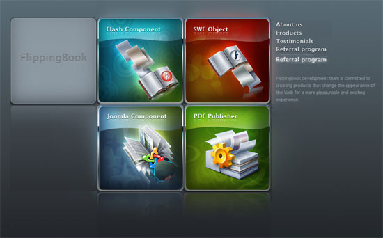
The effects on these icons are pretty cliche in some people’s books, what with the saturated hues and glassy reflections, but they’re still nice to look at.
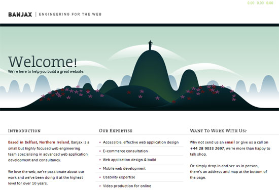
Header image aside, this site is really minimal but does a nice job with the text. The location map at the footer is also a nifty little touch.
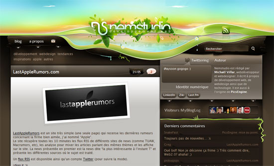
A splash of color and life at the top, only slightly trickling down as you scroll further. Then it becomes monochromatic grayish brown for the main content. I like all the lines and gradients and other details.
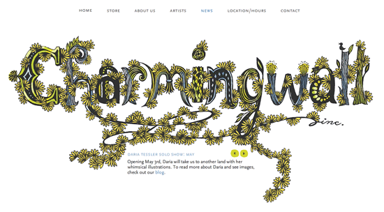
This is a purely Flash site, and you will adore the organic transitions as you click on every item in the menu. I especially enjoyed how the map (under “Location/Hours”) is formed.
Social Media Weekly
Design – The Photoshop Anthology: 101 Web Design Tips, Tricks & Techniques
If you’ve been looking for a definitive guide to Photoshop, this is it. Download the entire ebook completely free, but it’s only available until June 13 so hurry!
Design – Font Burner
Font Burner lets you pick from a thousand fonts and use them on your own website. How? Just follow the steps listed there. Yes, it’s also free.
Programming – Starry Night: Incredible 3D Background Effect with Parallax
Every since the teaser page for Silverback was launched, and the web design geeks discovered it was using the Parallax Effect, they stopped being in awe for a bit to recreate their own optical illusions using CSS. This one’s one of them. And if you don’t like stars, how about riding horses?


