This week on Friday Focus: websites that look like they made of paint, not pixels.
Designs of the Week
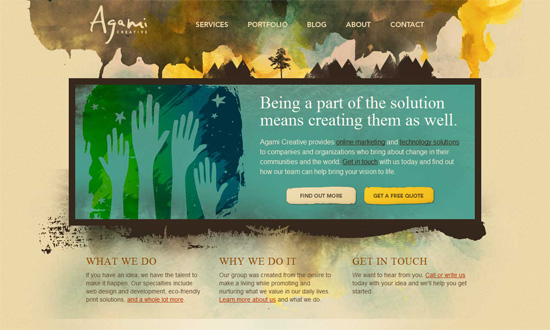
This look seems to match this company’s logo, but I would have liked that “relaxed” look to carry over to the headings and other elements of the site. Still, good imagery and hues.
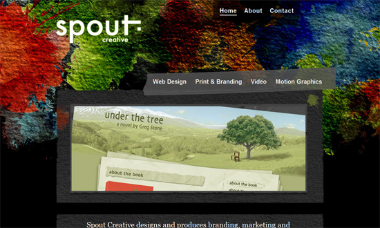
This site is not quite as polished as far as the grunge look goes, but the intense painted background texture provides a lot of personality.
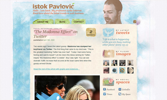
Now for something lighter. I love that almost every design element looks like it was drawn or painted, especially the icons on the sidebar. I don’t think I’ve seen a style like that on other hand-drawn/painterly designs!
This one’s even subtler. Unlike the featured sites above, the watercolor effect is more of an accent than the definitive look for the whole site.
Social Media Weekly
Design – Two simple ways to create text embossing effect
CSS – 15 Effective Tips and Tricks from the Masters of CSS
HTML – HTML5 Could Be the OS Killer


