This week on Friday Focus: websites with a fair amount of texture and a lot of personality.
Designs of the Week
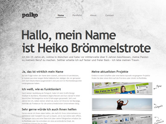
One good way to draw attention to the works in your portfolio is to make everything else grayscale or muted. That way the colors in your showcase really pop.
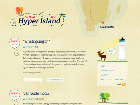
The background texture takes a backseat to the colorful and carefully designed illustrations on this blog. It does, however, tie in well with the general feel of land and sea, maps and navigation, kitsch and cozy.
Now this site seems to be the complete opposite of the previous two—it’s dark, it’s bold, and it’s got a lot of stuff going on. Yet nothing is out of place, and the use of transparency adds an interesting twist to the familiar formula of splatters and handwritten text to represent grunge.
Social Media Weekly
Design – 75 Powerful Adobe Fireworks Extensions – It really can be as Great as Photoshop!
A long list of add-ons that can transform Fireworks into an even more powerful graphics program.
Programming – jParallax
Replicate the famous parallax effect with the help of jQuery and this script. Check out the delightful demo for more information.


