Another dose of great sites with great illustrations that carry the design. Happy Friday the 13th Focus!
Designs of the Week
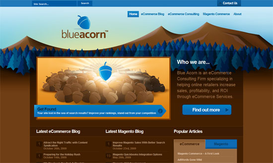
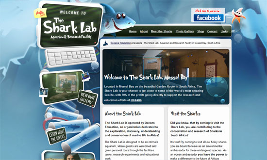
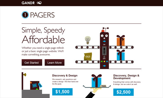
The blue and brown looks stunning. Everything’s so tidy and well-arranged.
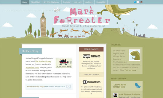
This design conveys playfulness but in a subtle way. Beautiful borders on the boxes.
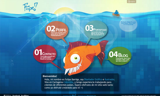
I adore the navigation. And the Twitter bird floating on the log!
I like how the designer used both the carousel and parallax effects on one page.
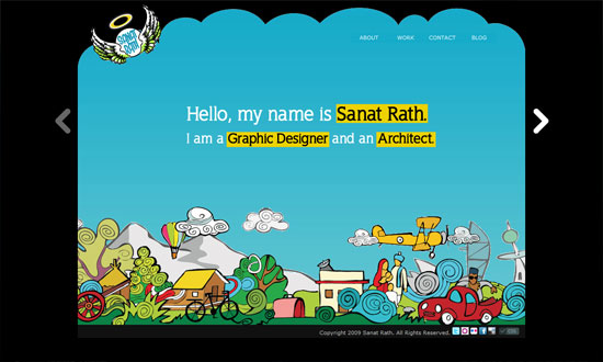
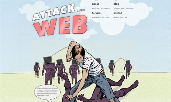
Would’ve liked a bit more of the comic book look in other parts of the site, but I enjoy the concept.
Fantastic concept and detail.
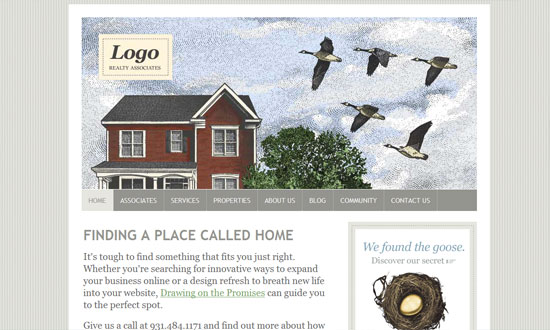
Beautiful use of classic illustrations to support that warm, homey look.
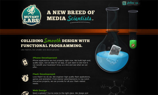
Chalkboard effect!
A fun way to illustrate the “refresh” services they’re offering.
Social Media Weekly
Design – Web Typography: Font Embedding Services
Programming – Is HTML5 good for application developers?
Typography – Legibility
