Week 16 is here, and a historical week at that. Tomorrow will be the day we hit 100K unique visitors, and we’re definitely excited. Here’s to another 100K of readers like you who will continue to make Devlounge a daily stop in their design journeys. Enough talk, let’s get down to business with week 16!
Sites of the Week
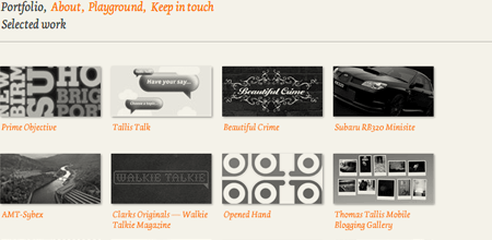
First up this week is Taktak. Taktak combines the use of xhtml and flash here and there to present a simple looking portfolio that’s effective and fun. Tans and orange and smiling clouds.
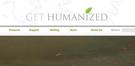
Next up is Humanized. A harmonious and earthly toned site gives way to some great time saving computer applications. Tans, light greens, and other light color combinations form Humanized.
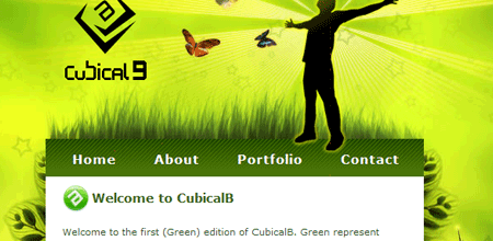
And finally to wrap up this week’s featured site’s there’s CubicalB. A lime green like this in most cases would be a shout out for “Gross!”, but the background image really helps pull this portfolio together and makes the use of this particular color green much more acceptable.
Digg Weekly
Design: 3 Reasons why Snap Preview Is Ruining Your Blog
For you Snap Preview Anywhere fans out there, I have to agree with this article; the service is extremely annoying when applied to every link on a site that does a lot of linking, and slows things down like crazy.
Programming: Learn RoR: Ultimate Beginner’s Guide
How ultimate is it? I don’t know, because I don’t know Ruby, but the more resources the better you can get, right? It’s from Sitepoint, so its a quality guide.


