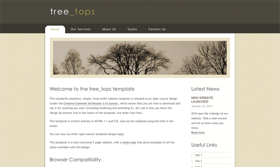
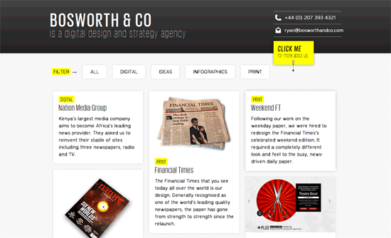
Not everyone is busy daily with CSS, which makes it understandable you don’t know CSS layout structure and code by memory. It’s good to have some good sources providing ready basic code to get started on a new website. The pro of using these layout is that they are already tested and bug free. [Read more…]
Search Results for: tutorial
Media Queries and the Thoughts Behind It
Smartphones and tablets have over taken the market. With high speed internet available, fast processors and sharp screens, everyone is using their portable device to browse the web. While about seven years ago we’d be discussing for which monitor resolution to design, now we have to design for everything, no ifs or buts.
From personal experience I know I want and use my iPhone for all my web browsing needs when away from my desktop. I expect that websites are coded for mobile devices. To achieve that you have to use media queries to serve your website in each resolution flavor, e.g. iPhone, iPad, Galaxy Tab, landscape and portrait.
Friday Focus 02/25/11: Yellow & Black
Here’s another popular color combination making the rounds: it’s yellow and black on this week’s Friday Focus.
Designs of the Week
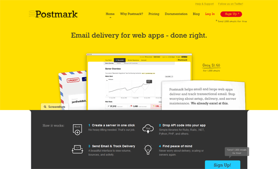
I don’t know if the average user can handle using a web app with a yellow background but it seems to be used relatively sparingly. The scrolling list of customers in the footer isn’t a groundbreaking idea but a nice touch.
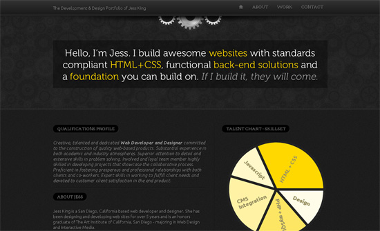
The line spacing is a little too tight. I would also say that the qualifications profile is one huge wall of text that could be broken up into more digestible chunks. I really like the helper text in the contact form section.
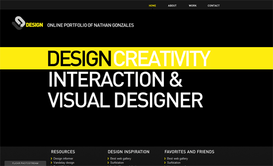
Simple but makes quite the impact. My only concern is using images for text, which is almost a non-issue with the prevalence of font embedding.
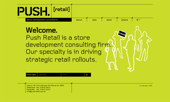
Old-school web techniques here, post-tables / pre-sprites era. Interesting choice to put the client login at the bottom instead of the usual top of the page, but the eye does wanter over there as well.
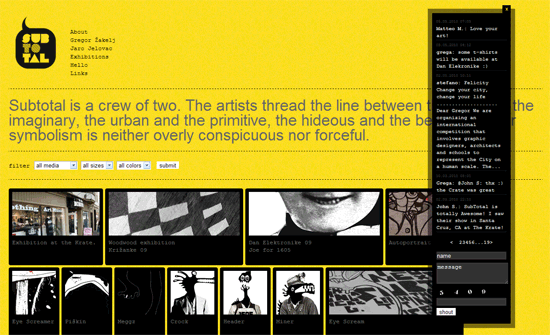
A little too fluid, monospace, and animated. The last one is interesting though: you don’t see GIFs used to display portfolios too often, and this method becomes a live exhibition of sorts,
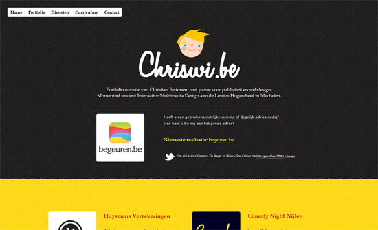
I may be turning into an old fart but the text is a bit small. I do like the youthful illustrations and paper texture.
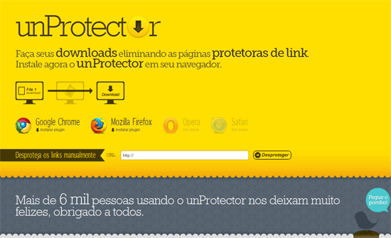
The logo is real text except for the second letter “o”—good idea!
Two things. This agency website puts the spotlight on their blog, while their particulars are tucked away in the header. Second, there’s surprisingly no footer. The question is, does it need one?
Now the use of yellow against black here is more subtle and only with the illustrations. The black on pink tooltips are a little too bold but I like how they’re styled.
Social Media Weekly
Design – Five and a Half Habits of Highly Effective Designers
“This article is about practice. It’s about five and a half — yes, half — habits that highly effective designers tend to share and which I’ve observed first-hand in the complicated, non-theoretical, absolutely real world. If practice is your thing, keep reading.”
Programming – Case Study: Page Flip Effect from 20thingsilearned.com
“Since the contents of the book is very much about open web technologies we felt it was important to stay true to that by making the container itself an example of what these technologies allow us to accomplish today.”
Accessibility – HTML5 Accessibility Chops: the placeholder attribute
“The HTML5 specification says “placeholder should not be used as an alternative to a label.” But it stops short of saying it MUST NOT be used, so it is conforming to use it as an alternative in HTML5 and will be used as a label.”
MooTools Plug-ins for Javascript Die Hards
jQuery is so mainstream and popular that other Javascript frameworks are often forgotten. There is Prototype, dojo and more. In the early days of Javascript frameworks MooTools was front runner.
MooTools is a compact, modular, Object-Oriented JavaScript framework designed for the intermediate to advanced JavaScript developer. It allows you to write powerful, flexible, and cross-browser code with its elegant, well documented, and coherent API.
As you can read from their site, MooTools is more for advanced Javascript coders. It has a more steep leaning curve than jQuery, while jQuery is easier to implement without much knowledge of Javascipt.
Javascript language was never a favorite of mine, I learned it at college before there were frameworks. Maybe it was the way they taught it that created my distaste for the language. The exam was with pen and paper instead of a computer, so we had to debug the code ourselves.
But those days are long gone, in between jQuery and MooTools there is the right framework for everyone. If you are handy with Javascript or want to be able to do more, you should give MooTools a try.
I selected nine MooTools scripts, many have their equivalent in jQuery but the MooTools versions are more versatile if you know your code.
Hat tip: Joomla! uses MooTools.
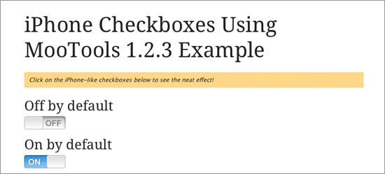
iPhone Checkboxes Using MooTools
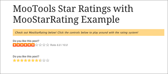
MooTools Star Ratings with MooStarRating
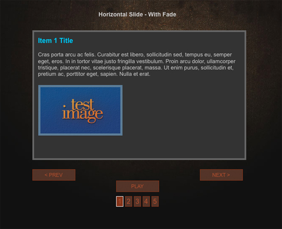
Mootools Content Slider Class v2
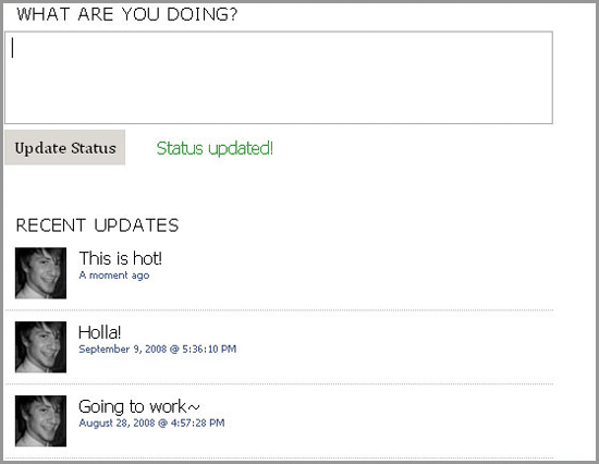
Twitter Emulation Using MooTools 1.2 and PHP
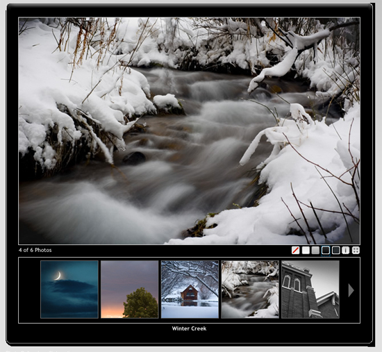
E2 Photo Gallery
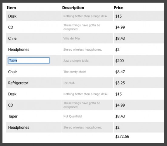
TableGear
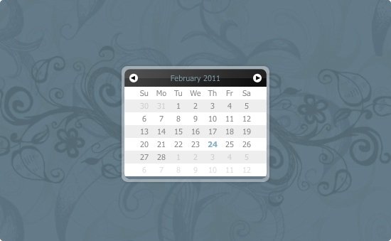
Calendar Eightysix
ImageZoom
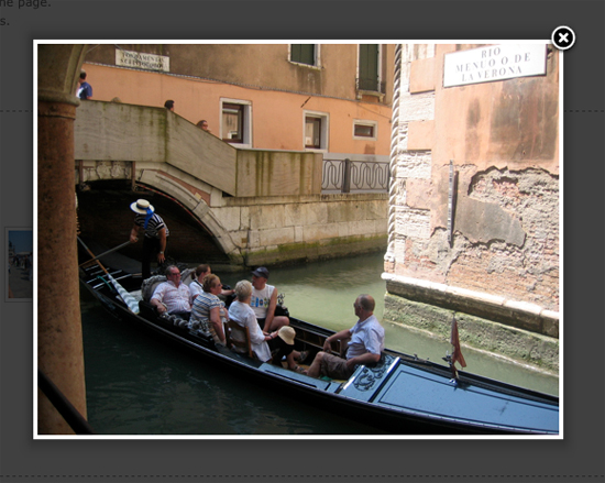
Facebox
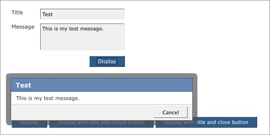
High Quality HTML and CSS Templates
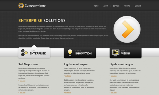
Following the last two posts on forms, I’m now listing 10 fresh HTML and CSS templates. They are ideal for implementing a modern form, while not all templates listed here are HTML5, you can replace the old doctype for the newest, <!DOCTYPE html>, supporting HTML5. After all remember that the new doctype is backwards compatible.
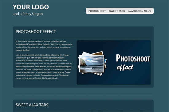
Two of the HTML5 templates are part of a tutorial, which is perfect for adjusting more considering that they come with explanations on the how and why.
If you need a website online fast, it is a matter of picking out a template and implementing the latest tutorials on HTML5 and jQuery forms.
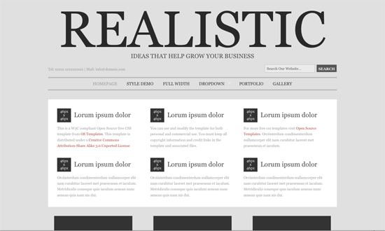
Realistic
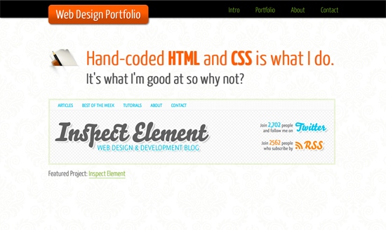
One Page Portfolio with HTML5 and CSS3
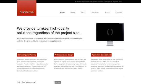
Distinctive
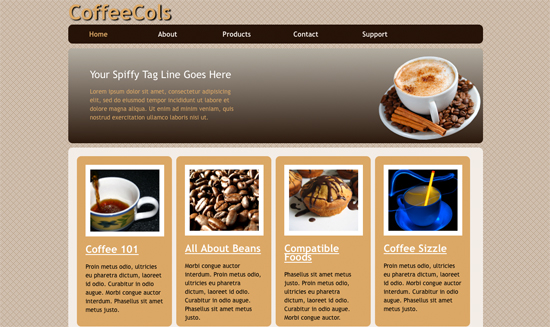
Coffee Cols
* HTML5
Download
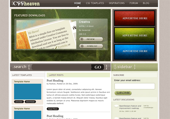
CSS Heaven 3
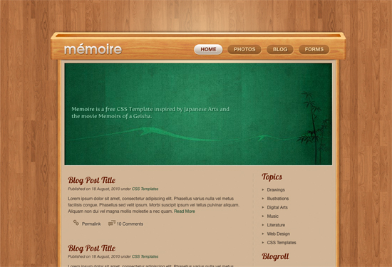
Memoir
* HTML5
Download
Outliers
Mondays

Coding a CSS3 & HTML5 One-Page Website Template
tree_tops
