The folded look on websites is still a strong trend. Let’s take a look at a new batch of sites that put it to good use on this week’s Friday Focus.
Designs of the Week
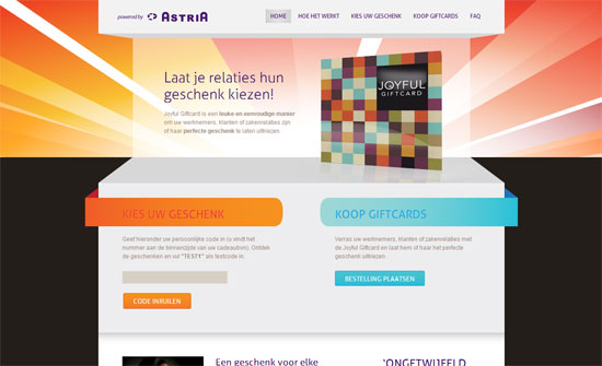
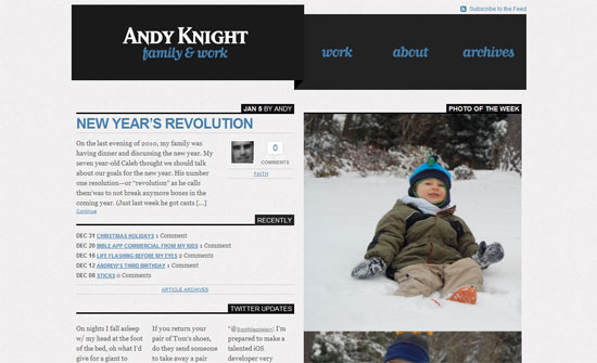
The introductory content stays on each page but automatically scrolls down to the main content on inner pages. Good solution if you want to keep things on every page but still give the user the option of scrolling back up instead of going back.
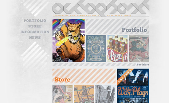
Love the type, the repeating diagonal stripes, and the arrangement of the images. The logo is barely readable but it’s certainly catchy.
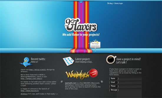
The rainbow stripe thing makes this feel dated but I really like the design of the carousel.
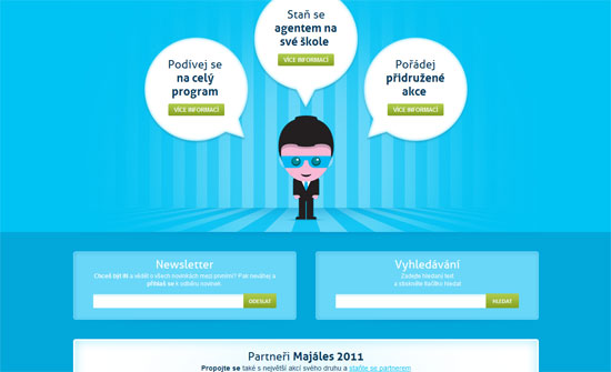
Very cute illustrations, and everything’s neatly arranged.
The script font softens the chunky blocks a bit. The way the layout is split right down the middle, with text on the left and photos on the right, is effective.
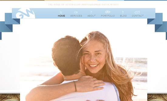
The navigation looks like a welcome banner here! Not a fan of the justified text and the type could be more refined.
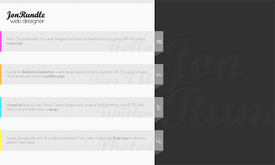
The content seems almost too narrow for it to be flushed left, but good idea to put the name in the background on the right. I wish the whole rows of text were clickable, or at least the icons.
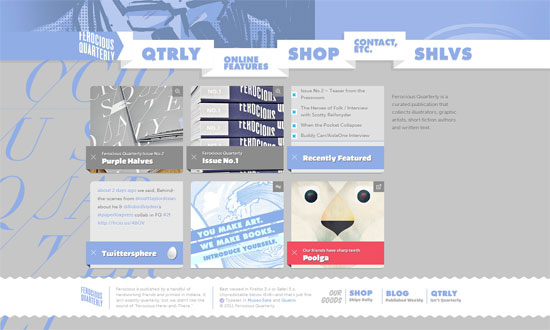
Sometimes illustration- or portfolio-focused sites tend to keep things minimal to focus on the work being presented, but I love this site for the way it seems to tell its own story through the design. Beautiful details everywhere.
Social Media Weekly
Mobile – Designing Mobile Experiences
CSS – Case Study: Getting Hardboiled with CSS3 2D Transforms
“In this example we’ll use CSS3 two-dimensional transforms to add realism to a row of hardboiled private detectives’ business cards.”
Typography – Web fonts via 2010
“Web fonts got a lot of sensational press last year. I urge you to look past the (obligatory?) handful of web font services that are routinely mentioned, and rather at last year’s extraordinary feats of professionalism that have catalyzed the growth of typography and web design right under our noses.”
Design – Web Design 2011: Normal No Longer Exists
“Web design has come a long way in the last three years. We’re (hopefully) dropping the idea of dogmatic solutions. We’re starting to realise that we need to think on our feet about business cases and target markets. We know that we have zero control over the viewer’s context and environment.”
User Experience – humans.txt
“It’s a TXT file that contains information about the different people who have contributed to building the website.”
HTML – HTML(5) and text-level semantics
“As an absolute type nut and militant web standards advocate, one of the most exciting things that HTML5 brings for me is not the new structural elements like <header>, <aside> et al (although they are pretty awesome) but rather the text-level semantics it brings with the addition and redefinition of certain elements.
