We’ve seen a lot of slanting, skewed designs before, but there seems to be an even more specific trend related to that: cropping away text by the use of diagonal lines, as though their edges have been slashed away.
Designs of the Week

The way the images are sliced are extremely odd and even unsemantic. Why not just reuse the dividers and background headers per section? Splitting a large image is a little more understandable perhaps to load things faster, but that also means you’re making multiple HTTP requests.

Here’s another site that uses triangles (and a couple of other shapes), and I like how it frames the Work section nicely. The use of green on the hover boxes is a little surprising even you do see it in the logo. Also, the lightbox mentions website URLs, but are not linked. Is that on purpose (some designers don’t like people to see the finished product cause there’s a good chance it’s been wrecked by other people already!) or a limitation of the script?

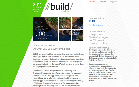
While the Metro user interface that’s coming to Windows 8 impresses me, this Build logo—which is supposed to promote that same slick feel—does not. This also applies to the rest of the site design. Using Segoe with Georgia doesn’t feel that modern at all. There are bits of the Metro look here and there, but they could have taken things much further. Maybe because it’s just a conference site?
Social Media Weekly
Typography – FreeFacing
A subsection to the site Layman’s Layout, FreeFacing recommends various typographic styles using only the free fonts available on most computers (OS fonts, Adobe fonts, MS Office fonts). There are also diagrams grouping similar styles and looks (lightweights, heavyweights, cheeky, elegant, etc.).
HTML5 – The <details> and <summary> elements
More information about new semantic elements <details> and <summary>, with further explanations and examples from the HTML5 Doctor.
HTML5, CSS3 – haz.io
Which HTML5 and CSS3 features does your browser support? Visit load this website to find out.
JavaScript – What’s a Closure?
Nathan Whitehead teaches JS closures starting with the most basic lessons and builds from there. Learn by entering code directly on the page.
Design – Developer Lorem Ipsum
Need placeholder text? Try paragraphs upon paragraphs of developer buzzwords!
