This week’s featured designs business card websites, some of them looking literally like cards containing contact information of their owners. That means very minimal layouts but still all compelling experiences.
Designs of the Week
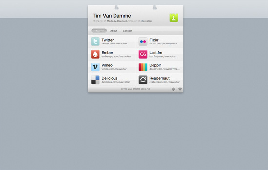
First up, the site that started this trend. The design may be over a year old but the graphical details are still all the rage today. One of the most important features for this genre of a site are the vCard download link and the social media links, accompanied of course by the colorful icons for each site. No tabs here, but each section in the menu loads with a vertically sliding animation, while the hover effects use horizontally sliding effects.
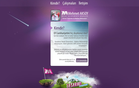
The shooting star in the background is actually animated with Flash. So are the stars which twinkle. There’s a touch of the Aero (Windows Vista/Windows 7) interface in this design (particularly the avatar) but I feel it’s the custom font used on this page that gives a different look to the whole site.
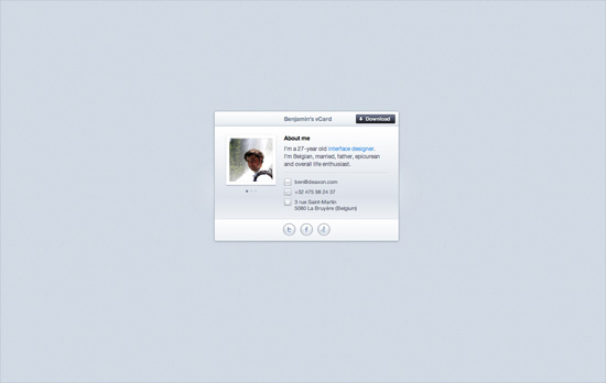
This site greets you with the owner’s name then displays a closed box, which you click on so it pops open to reveal this card. The animation even contains accompanying smoke effects. Other visual treats to enjoy on this page: an icon-based website tooltip on the text link for “interface designer”, glowing hover effects on the bottom icons, and a slider for his three avatars.
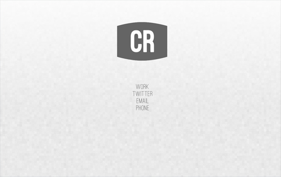
Not the usual boxed in layout but it’s all only contact information in here. Hovering over the initials reveals the full name and occupation. Same goes for the links below it.

A nice earthy look with icons that blend in and a slideshow running in the polaroid frame to the left. There are some portions though where the graphics make the text a little difficult to read and are competing for attention with the foreground.
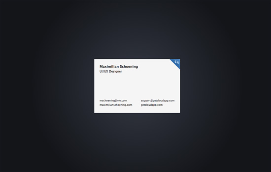
The closest thing to the business card metaphor translated to a webpage, complete with an animated flip done with CSS3 transforms when you click on the top right blue corner. The background uses another CSS3 property, radial gradients. The other side contains nothing but tiny social icons.
Social Media Weekly
CSS – The CSS profilers are coming!
“Back in August I talked about the lack of benchmarks or performance tools for CSS. In the meantime, the fine folk we call browser makers have been working hard on new developer tools to do just that: measure CSS performance.”
CSS – Truncating text using only CSS
“It works in IE 6+, Safari 4+, Firefox 7+, Opera 11+ and Chrome 10+”
Design, Business – Warm Gun: Design for Continuous Deployment
“In his Design for Continuous Deployment presentation at the Warm Gun conference in San Francisco, CA Randy Hunt shared how Etsy’s development process allows designers and developers to collaborate at scale on production code.”
CSS – Knyle Style Sheets
“Inspired by TomDoc, KSS attempts to provide a methodology for writing maintainable, documented CSS within a team.”
