Let’s have some collage and scrapbook style web designs for this week. It’s like the lighter, less angsty grunge!
Designs of the Week
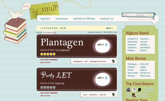
Rarely do font and gallery-type sites get a highly stylized treatment, so this one’s a breath of fresh air. Even the login form is nicely decorated, although the field sizes could have been made bigger.
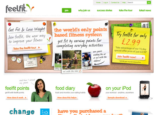
Excellent use of javascript to animate the images and text—why bother with Flash? And the overall look is clean and light, which is what a fitness program is supposed to make you feel.
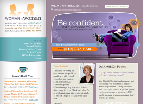
Beautiful typography, imagery, and colors. I like that the blurb has atypical rounded corners that break away from the boxy articles below it.
Social Media Weekly
Design – January UX Roundup
UX Booth’s monthly roundup on user experience design and usability.
Design – 12 resources for getting a jump on HTML 5
Get up to speed on the next version of HTML.
Programming – 20 Useful Resources for Learning about CSS3
If there’s HTML5, then there’s CSS3!


