This week on Friday Focus: websites adorned with colorful, abstract flourishes that give movement and energy to the designs.
Designs of the Week
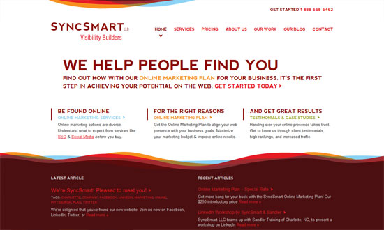
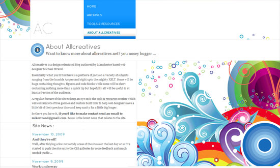
No boxes, barely any straight lines. Just areas of content and the graphics to distinguish the header and footer areas.
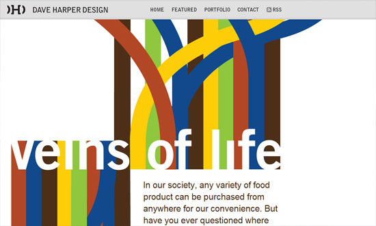
The striking graphics here aren’t really part of the overall design but of a specific featured article, and you can expect things to change when the site author publishes a new one. This “art direction” trend/idea is really popular now and a great source of new, ever-changing site designs.
The design needs just a little bit of refining but overall, fun to look at! Check out the icons in the inner pages.
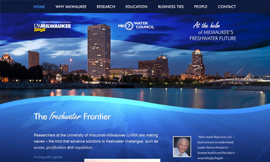
A great photo, a color you can’t go wrong with, and some wavy silhouettes to soften things up, and voila. Stunning.
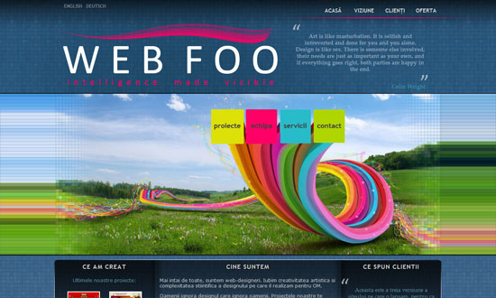
What I really love here is the way the right-side menu was designed. Which is why I’m disappointed the left-side menu doesn’t match. Or why there are two menus on either side like that. Also, there are several fonts used on the site; it can stand to be a little more consistent.
The spacing is a little too tight, and the custom font in the pullquote is not very readable, but other than that I like it.
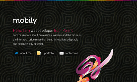
I love how there’s exactly one decorative graphic in the foreground, like a sculpture of sorts. The background pattern is strong too, but not to the point that it’s distracting.
Social Media Weekly
Design – Oldest Design Galleries
Optimization – The real world costs of an heavy website
Business – Contracts 101 – Part 1: Outline
