The last Friday Focus of the year is going to be all about big, bold designs. Time to go out with a bang!
Designs of the Week
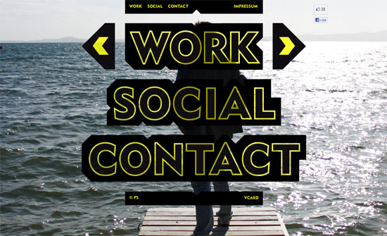
I appreciate all the irregular shapes especially in the Social section. I also noticed that yellow and black is a popular color combination these days.
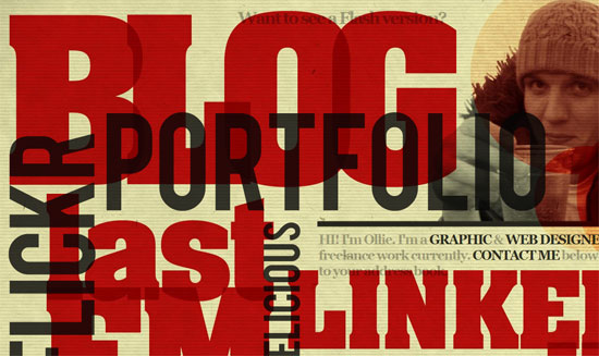
Very ambitious and is a little on the chaotic side. I also find it a little confusing when the links go to a differently-designed site. This may be a business card-type site but it may be better if the identity is consistent, at least with a logo appearing in both places.
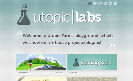
Nice and airy. The animation at the bottom looks great.
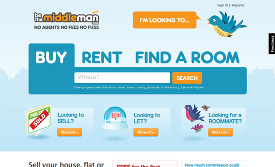
The illustrations, animations, and type look great in the top half, but the lower half and inner pages feels cramped in comparison, there’s a little disconnect going on.
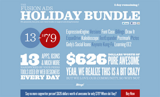
A bit overwhelming because of the colors and type, but I love the infographic section below.
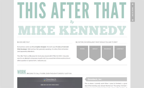
Another site with some infographics in it! I think because of the very light color palette it makes sense to lower the opacity a bit until you hover over the images. It’s a little confusing, though, to put the subsection tab navigation for Work at the bottom. What I do like is the tab on the side that lets you move between sections on this one page site. Makes me wish every site had it.
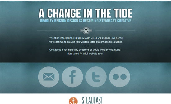
It’s a little weird when the biggest things on a page are social media buttons, but I guess it has merit in this case.
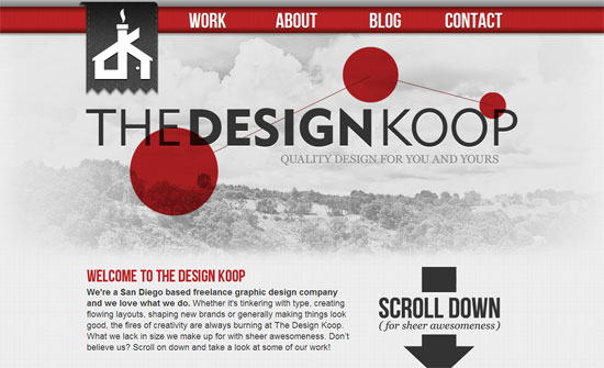
Good idea to keep the navigation fixed, but with the huge logo too? Not sure about that. The folded ribbons in the carousel navigation is a nice touch.
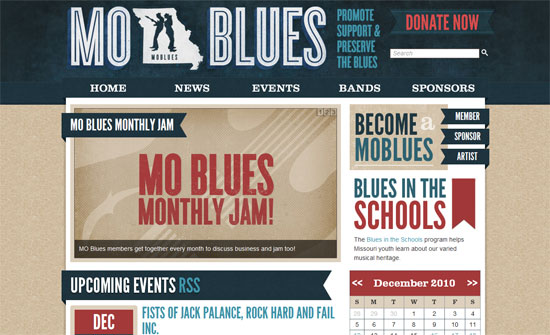
Love the grungy feel everywhere, mixed with ribbons and huge datestamps. Impeccable.
Social Media Weekly
Design – 2011: Time To Push Yourself
“Make sure 2011 (and every year after) is the year you expand your design and development toolbox. Make sure it is the year you take the time and effort to play with these new technologies so you can be prepared for the time they are available on all browsers.”
User Experience – 7 myths about paper prototyping
“Paper prototyping is probably the best tool we have to design great user experiences.”
Interaction Design – The IxD Library
“The IxD Library is a collection of books, articles, and presentations of interest to interaction designers. It attempts to not be the definitive collection of every piece of content about interaction design, only the best and most influential.”
CSS – Angled content mask with CSS
“In this article I will show you how to do create angled CSS content “mask”. The idea is pretty simple and it uses CSS transform property (rotation to be more precise).”
CSS – Remote controlled hyperlinks (or multiple links in one hyperlink)
“What I wanted was a cool way of giving the impression of two separate links to the same page but also making clear that the two links both did the same thing.”
CSS – Checkerboard, striped & other background patterns with CSS3 gradients
“What you might not be aware of, is that CSS3 gradients can be used to create many kinds of commonly needed patterns, including checkered patterns, stripes and more.”
CSS – WebKit Image Wipes
“It’s not “spec,” but WebKit browsers support image masks. If you are familiar with Photoshop, they work like that.”
Design – The JESS3™ Design Process.
“you should wireframe more than you design, you should design more than you code. design twice, code once.”
