Happy free 7-11 Slurpy day! Happy iPhone 3G day! Let’s celebrate with some sleek websites this week. They’re mostly blue, gray, blue-gray—that seemingly drab section of the spectrum actually manages to turn up excellent designs, so don’t shun it just yet! Oh, and we have a ton of examples this time, so brace yourself!
Designs of the Week
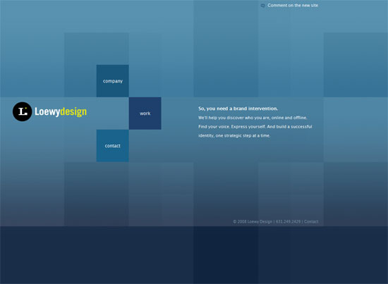
I love the subtle navigation and portfolio item effects here. A few years ago this page would probably be constructed in pure Flash, but it’s amazing what you can do with simple JavaScript these days.
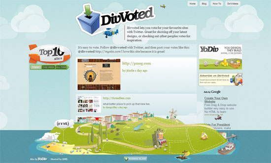
This fixed-footer layout technique is reminiscent of StrawPoll, which is also a voting site that uses Twitter. But there’s a twist: you can hide the island if it’s getting in your browsing way.
I guess you’d say that this website has typical “Web 2.0” elements in it: gradients, reflections, rounded corners…everything except for the candy colors of all those crazy webapps. This is a reminder that despite their overuse and misuse, a good-looking website can still emerge using those tried and tested techniques. The tip here is to avoid the bright hues in the structural elements, but keep them in the “accessories” like the icons.
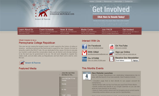
Another muted design here—not just the blues, but the reds. Though I think the gray background is a little too dark and close to the color of the text, which could be a contrast issue with some people. I particularly like the navigation tabs, including how they described each section so you have an idea of where you’re going.
Now this is a very strong design, even though its colors are practically monochromatic. It’s all in the details and the right amount of contrast, while maintaining this boyish feel.
I love the use of (faux) transparency here. Normally I wouldn’t be too thrilled about the black to light gray gradient because it’s so abrupt, but in here, it’s a great lighting technique. Again, another almost-monochromatic design that still looks interesting.
