This week on Friday Focus: another roundup of sites that play the transparency card very well.
Designs of the Week
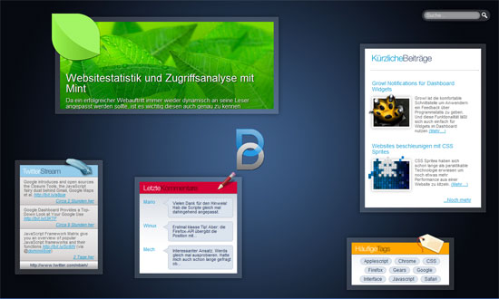
I love a good freeform layout. It does get more organized in the inside pages, though, so best of both worlds!
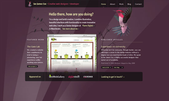
The translucent effects are so subtle, it makes for an elegant design.
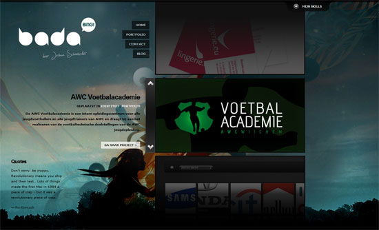
Lots of great things going on here: how the portfolio items that aren’t in focus are darkened, the pull-out panel that displays the designers skillset, and the overall edgy look for the site.
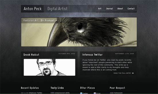
Custom type and lovely art both go a long way for this site!
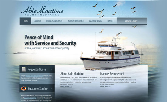
The not so subtle way the content area fades into the background is stunning to look at. But the boat images need improvement, ironically in the transparency department. Still, a gorgeous site.
Social Media Weekly
Design – The Future of Interface Design
Programming – The 3 Basic Rules for Writing HTML
