Our featured sites this week all have fresh and brilliant navigation techniques you’ll surely envy. Be sure to click on the links to see them in action. Ready to be inspired with this week’s Friday Focus?
Designs of the Week
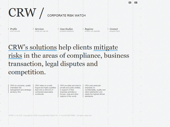
You might not notice how disciplined it looks at first glance, so look more closely at how everything revolves around the grid. No fancy graphics here, because it’s the variation of lines (light, dark, solid, broken, handwritten) that bring personality and texture to the site.
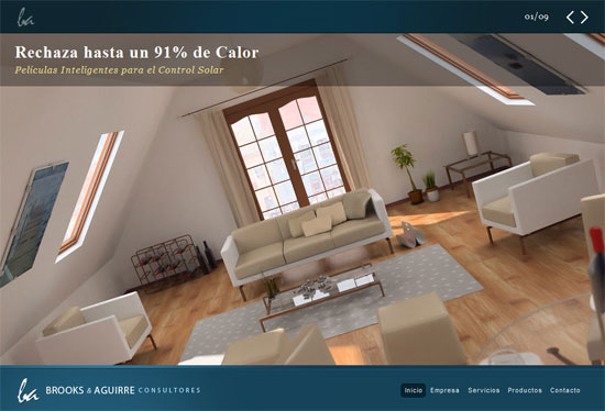
The best designs tell great stories. This site comes to life as though its speaking to you and telling a story. It takes your hand and brings you to different places, and you’ll certainly come back for more.
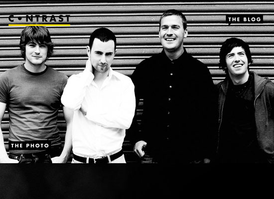
To tell a good story, “show, don’t tell”. Now apply that concept a website with the help of illustrations or in this case, photographs. I love you can still see them as the text sections expand below, acting as header and background to the whole design.
Social Media Weekly
Design – Design Top 10 – The monthly pick of online design
This site also has excellent navigation, but more importantly, it’s another great resource to keep your eyes on every month.
Design – 7 Usability Mistakes Usability Experts Commit
In commemoration of world usability day (November 13), try to follow the tips from this article to improve the overall experience websites provide.


