Another Friday, another Friday Focus. This is the last edition where I’ll be flying solo, because as of next week Ronald and I will begin both contributing to the Friday Focus content. This means double the favorite designs of the week, double the favorite Digg Links you may have missed, and even more web related goodness! Ronald did have enough time to contribute to this weeks with the results of his “Best Footer Design” question from earlier in the week. Also, starting next week Friday Focus will now be credited to the “team” (as the author), meanings it will be a multi-staff effort to sum up the best of the best each Friday.
Sites of the Week
The next entry got my vote because of the illustration in the header. Not only that, but the site flushed well with it, and minor touches of flash only helped to smooth it all up.
Finally this week is the Happycog design. For makers of ALA, Events Apart, and many more happenings, they can still put out great looking designs.
Digg Weekly
Design – 8 Web design tricks to help you when your stuck
This SEOMOZ article outlines 8 ticks to help you when you run into a rough patch in your designer journeys.
Programming – Good coding habits
This article explains some “good” coding habits that they believe if you follow, you’ll be able to be much more organized and successful.
Best Footer Design?
Written by Ronalfy (a.k.a. Ronald Huereca)
Earlier this week, I asked what the readers what they thought was the best footer design. I also asked what you thought about content in footers.
Some of the replies to support content in the footer were as follows:
- A good footer can lead the user to other site content.
- A good footer aids the user in navigation.
- A good footer can help unclutter a web site.
- A good footer shouldn’t contain too much because after a while, it stops being a footer.
Because every site is different, it is tough to give practical advice on what makes a good footer and what doesn’t. However, two of the readers pointed out some footers that I wanted to share. I also included one from the examples I gave simply because I really liked the concept.
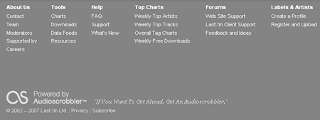
Several of the readers pointed out that they liked last.fm‘s footer. I am not a user of the site, but the footer definitely aids the user in navigating the site.
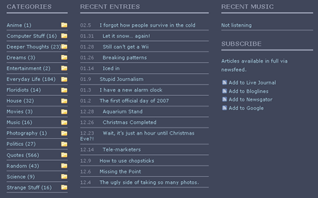
The next footer is from Makesitgood. This footer has a nice listing of categories, recent posts, and other standard footer information. This footer is a good example of how to give readers a place to go when they are finished reading the content. One suggestion I have for this footer is to fix the dates in the ‘Recent Entries’ section so that everything appears flush with the left.
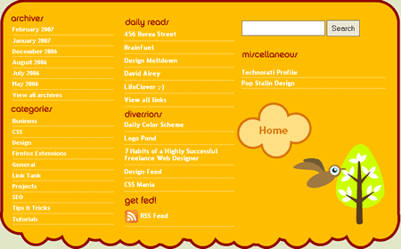
This next footer I am absolutely in love with. If I could marry a website footer, this would be the one I would take back home to my mom. The footer comes from The Propaganda Party blog. I love the design and I love how it enables users to easily navigate the site after reading the content. The only suggestion I have for the footer is that it might benefit from a ‘Recent Posts’ section.
Weigh in! What do you think?
