Issue number 42. Exactly 10 weeks to go until we hit a year. Enjoy the weekend everyone!
Sites of the Week
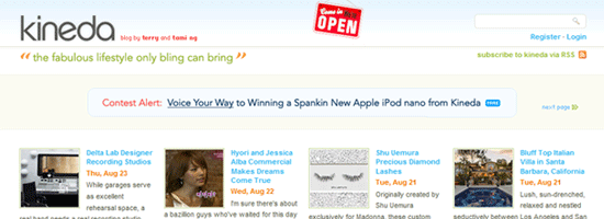
Leading off this weeks top three is Kineda. How many times are we going to feature this place? I believe this is the third time Kineda has made the list, but every redesign looks cleaner and cleaner. I wish the Devlounge homepage was arranged like this, as I think it is very effective and helps tremendously with exposing a lot more content to the visitor. It gives me ideas, but as I said, I’m not redesigning this anymore – I’ve done enough of that already.
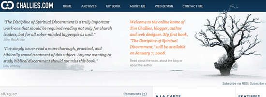
Next up is Challies. Another refreshingly clean magazine / portal style layout featuring lots of blues. Three columns and fairly polished up.
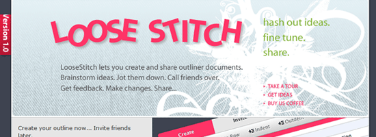
Wrapping up this week is Loose Stitch, an outlining app. It looks like the application interface itself is pretty clean, so I think I’ll be taking a look at this some time over the coming days.
Design Float / Digg Weekly
Design – A CSS Styled Table Version 2
Another great tutorial from Veerle. Nice and detailed, and comes with a clean final result (of course).
Programming – Image Browser Controls
Another tutorial, this time from Pup Image on the common right / left arrow controls found on a lot of images theres day when shown as a gallery / slide show.
Other News
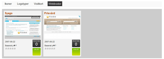
Earlier this week I released Particles, our newest WordPress theme. As I mentioned, its lightweighty-ness (not really a word) makes it a great theme to build upon. If you didn’t believe me, check out this screenshot from a blog we’ve been watching via our refer logs that has been building off of the Particles theme to make a web gallery. Obviously, it is still a work in progress, but it’s only been a few days.
