This week on Friday Focus, we’re looking at sites that revolve around iconized representations of their content.
Designs of the Week
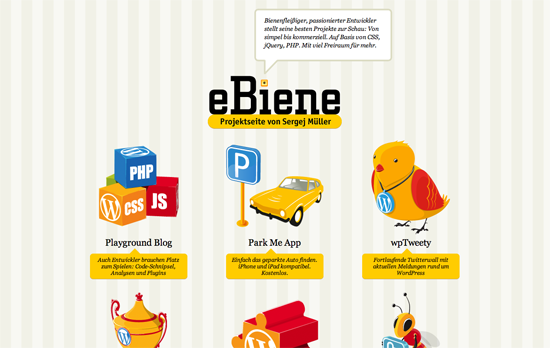
This has quite the preschool room feel (down to the background wallpaper), probably because of the primary colors. If icon illustration is your strength, best to flaunt it this way.
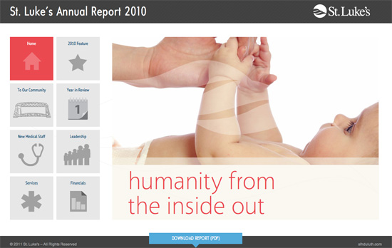
Clean, straightforward brochure site with subtle design touches here and there. One advantage of having larger icons for main navigation is a bigger area to click on.
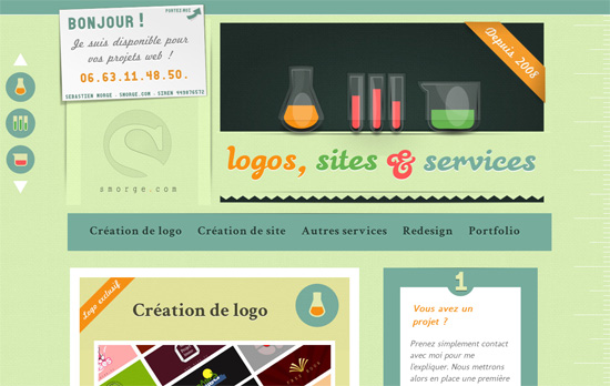
Love the colors. One has to ask, though, if the choice of laboratory glassware for each content section makes sense (how does a set of beakers relate to site creation, actually?).
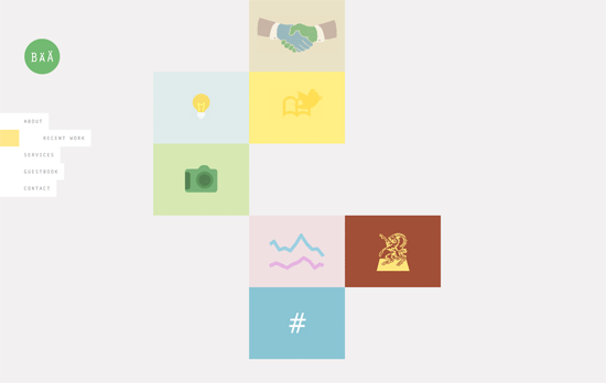
The challenge in using icons at the forefront is keeping the look cohesive. Here, one of the projects in the portfolio sticks out a little bit and could have been a tad more muted, although overall it still looks great. But I’m not a fan of the <br> overuse.
Social Media Weekly
CSS – dom3d: rendering 3d with CSS3
“There are a few benefits to this approach: you get to manipulate the elements with normal CSS, and you can overlay 3d objects onto pages and still let the user interact with the page.”
CSS – Styling ordered list numbers
“The key is using CSS generated content to create and insert the counter numbers after removing the default numbering from the list.”
Web Browsers – In IE, iFrames on Pages in Quirks Mode Also in Quirks Mode
“If you are creating a page using HTML5 and you think there is some reasonable chance that someone may embed this page on another via iframe, you should use the HTML5 shim on it for all version of IE.”
Design – Crash Course: Design for Startups
“I’ve learned why my work nowadays is better than from years past. I am aiming to somehow share some of these thoughts brewing in my head with this post today.”


