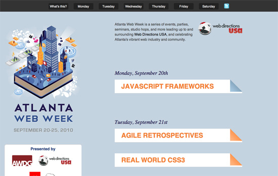
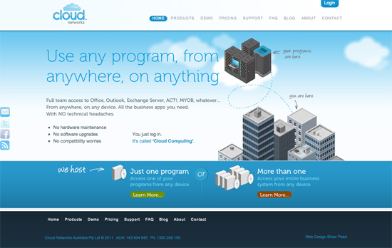
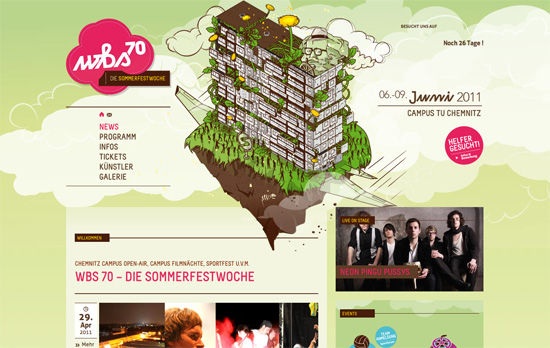
This week’s designs feature illustrations with the isometric perspective in them, giving the sites an interesting birds-eye view.
Designs of the Week
I like the idea of centering a conference website around a week, instead of the regular schedule-speakers-venue-register variety. Of course it’s a trade-off, but in this instance the brand was centered around the “week” so it follows.
Using moving clouds in the background is pretty predictable, but combined with the perspective of the buildings, and mountain illustrations on several pages, it makes sense to feel that you’re high enough in the air to actually be going through them.
Even more clouds in this design, but what’s great is that they’re used everywhere, as backgrounds for event icons and other content boxes. This is topped off with a nice fly-in animation when you load each page.
Social Media Weekly
HTML The hgroup hokey cokey
“To offer a quick recap, hgroup was removed from the W3C specification only (not the WHATWG spec) by Hixie at the request of Steve Faulkner. The co-chairs requested the issue be reverted following multiple requests from the likes of Tab and Tantek. The current status at the time of writing is that hgroup is in the spec.”
Accessibility, HTML, CSS, JavaScript – Front End Development Guidelines
CSS – Holmes: The CSS Markup Detective
“Holmes is a stand-alone diagnostic CSS stylesheet that can highlight potentially invalid, inaccessible or erroneous HTML(5) markup by adding one class.”


