Backgrounds are so called for a reason. They’re meant to support and complement instead of attract and distract. This week’s featured sites, however, provide a whole other level of interactivity and usefulness to backgrounds. You decide if they’re a good idea or not. Either way, they’re interesting concepts that can only be executed on the Web, so, enjoy!
Designs of the Week
Information visualization
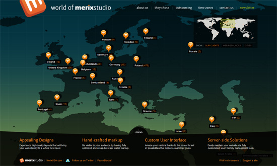
Showing clients/web resources/cities on a world map as a background is brilliant. I don’t think it’s been done this way before. If the movement gets too annoying, you can stop it with a click. The “worldwide” concept carries over to the Time Zones section, which shows both the current time in your area and theirs, as well as how long before their office closes—what a sensitive little idea!
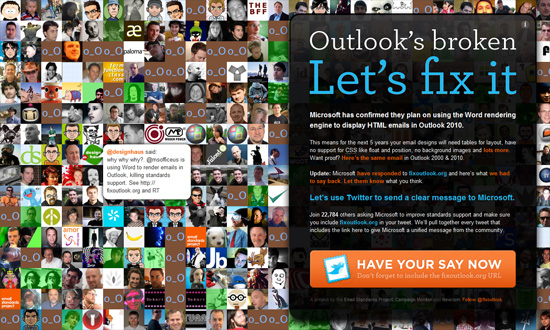
Lots of Twitter-related sites that pull tweets on a certain topic are mostly text-based and don’t usually create a wall of avatars with random popup tweets in the background. When new tweets arrive, the avatars shift right as new ones appear. And as for the foreground? Good typography, contrast, colors, and use of icon. Another well-done one-page site.
Parallax effect
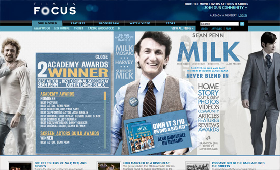
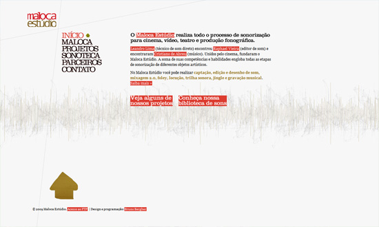
Flash-based, but definitely well done.
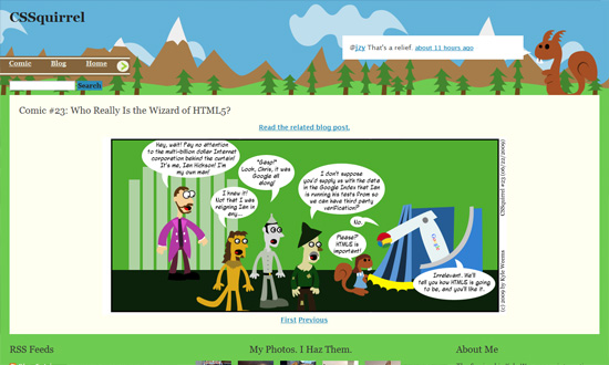
Bright, fun illustration-based design. Fluid width too.
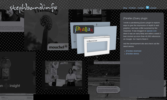
I like that the parallax effect works whenever your mouse moves. The background is light and subtle enough to not be distracting.
Navigation
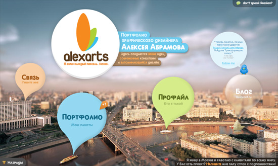
The foreground and background fuse on the homepage, but when since the inner sections are loaded in a lightbox, you can still click on what is now the background. Anyway, very cute design elements, including the tilt-shift effect for the photographic background. And don’t you love the paper boat on the river? The greatness is in the details!
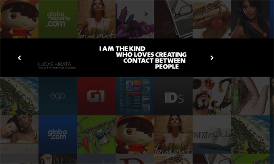
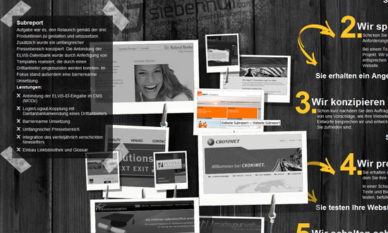
I love what the copy says, which at the same time serves as the navigation to the inner sections of the site. And the background is literally made up of the designer’s portfolio. And it looks good!
This effect might give some people a headache. But I like that the objects in the background can be any size or type—image, video, Flash animation, screenshot, poster, etc.
This one’s got more design elements for a polaroid photo collection metaphor, shadows and all. Not pictured: the designer’s latest tweet and an anti-IE6 disclaimer. One more thing about this effect: it works regardless of browser width.
Social Media Weekly
Applications, Workflow – One Day in the Life of a Web Designer
Great twofold guide for discovering helpful apps and formulating an effective routine for professional designers.
Design – 27 Must-Have Starter Kits For Web Designers
You don’t always have to start from scratch; you don’t have to reinvent the wheel.
Programming – How to properly “speak” HTM language
A nice little tutorial on HTML semantics.
