Subtlety is the name of the game this week on Friday Focus. We’re featuring designs with light hues and textures for a relaxing, elegant feel overall.
Designs of the Week
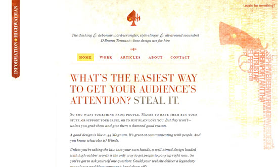
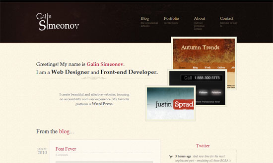
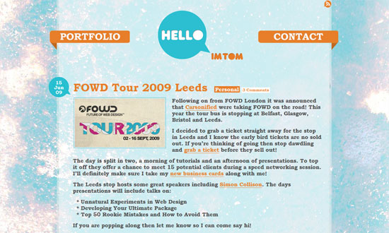
Love the texture on the blurb itself, not just in the background. And the use of rotated spades as bullets? Lovely.
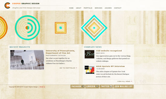
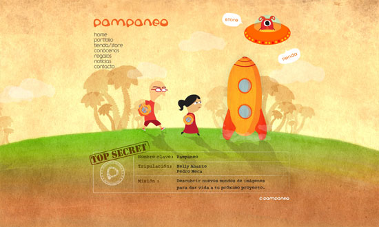
I really like the asymmetrical elements in this design. And it feels organic and warm as opposed to loud and bold—a different take on what design firm websites typically look like.
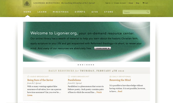
Airy, open design. What I could call a “pretty much perfect”!
I’m not sure what the reasoning behind a left-aligned design is, but it’s interesting to see that isn’t completely extinct. Also interesting: the ad placement on the left side.
Everything’s so nice and wide, including the neat dropdown menus.
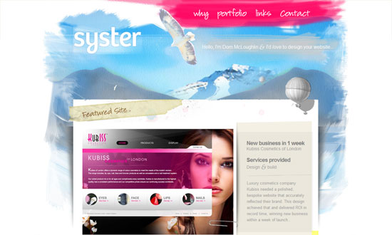
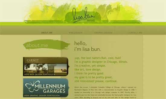
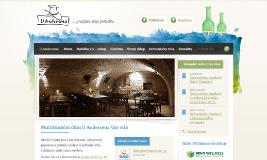
I really like the way the edges of the “paper” layout have thumbprints on them, aside from the shadows and watercolor paint below.
The repeated use of the curly brace as a design element is a great touch.
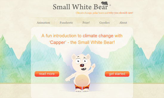
Animated elements in headers are getting more popular too. I just think I want the navigation to have bit detail to it.
The only thing that bothers me is the way the button is designed. It’s very striking, yes, but I think it could be done better.
Love the stack of images that each comes to the front upon hovering.
Note how there’s not a whole lot of links in the header, and that they’re all big clickable things, which makes the visitor’s browsing choices dead simple.
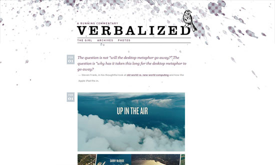
A straightforward enough layout (it’s a tumblelog) but the background at the top makes all the difference.
Another watercolor-y approach, but you won’t tire of the details all over.
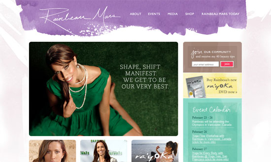
I think my favorite part here is the sidebar!
Social Media Weekly
Accessibility – Is Web accessibility a human right?
CSS – 47 Amazing CSS3 Animation Demos
Design – 5 Well Designed Icon Tutorials
