Going dirty has never looked this good! It’s grungy websites this week on Friday Focus.
Designs of the Week
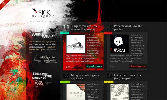
It’s interesting how despite the chaotic background you can still make out the boxiness. A nice contrast.
I like how the site is designed as this screaming poster for the band. The content for each page is minimal and concentrated in the middle. The style is a bit of old school webdesign with the custom scrollbars and whatnot, but impact looks like the top priority here.
Again, this looks chaotic but at first but you’ll find the screen divided into three: the navigation area, the content area, and the slideshow area. Simple.
I just love how well-integrated the navigation is into the design, which happens to be a bit cheery and not just the usual angsty grunge. Another thing I like: the custom background for the lightbox overlay—a lot of people don’t bother changing that, and here it matches the design.
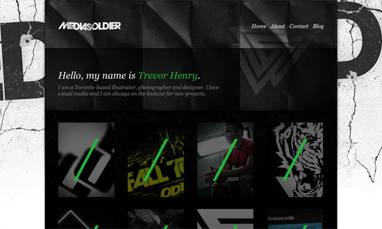
Truth is, only the background is the grungy part. The foreground is a very interesting folded paper texture, which even influences how the logo looks. Also interesting is the treatment of the portfolio items.
Social Media Weekly
CSS – Progressive enhancement: pure CSS speech bubbles
“Speech bubbles are a popular effect but many tutorials rely on presentational HTML or JavaScript. This tutorial contains various forms of speech bubble effect created with CSS2.1 and enhanced with CSS3. No images, no JavaScript and it can be applied to your existing semantic HTML.”
Usability – 5 Can’t-Miss Usability Tips for Mobile Website Designs
“Because of the instability in a lot of the mobile web design information that is being distributed on the web, a lot of websites have very poor mobile interface designs. Below, we’re going to cover a few simple, yet prominent steps to designing a much more effective interface and increasing the quality of a mobile websites usability.”
JavaScript – The Total Newbie’s Guide to jQuery: Select Elements and Manipulate CSS with jQuery (Part 2)
“If you’ve been wanting to learn the basics of jQuery and start adding some dynamic interactions to your website, this is the place to start. If you’d like to follow along with the code in this article, download the sample, which includes all of the code examples from the book.”


