This week on Friday Focus: excellent websites that happen to have fixed elements in them.
Designs of the Week
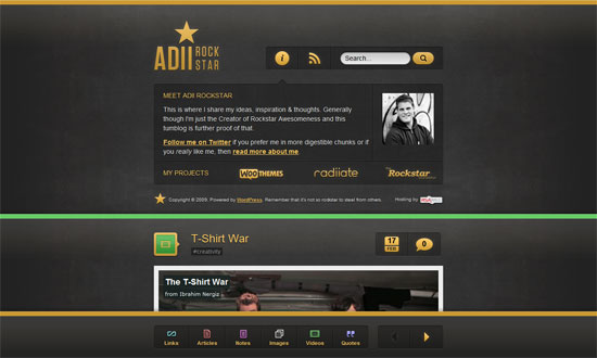
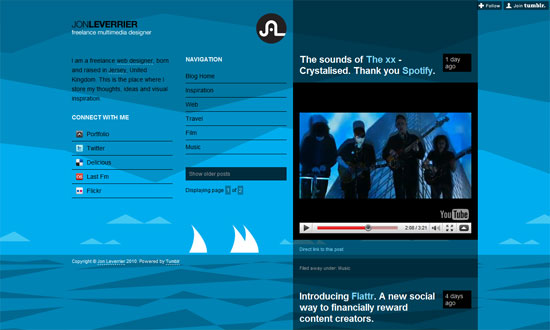
Not only do we have a light on dark design here, but a glowing light on dark design. It’s colorful too, because of the thick demarcations color-coded by content type. My only wish is for the search bar to be part of the fixed area; I think that’s just as important a navigation element as pagination.
Interesting choice of content in the fixed area: name and contact info (very important), quick links to portfolio items grouped by year, and quick links to additional info about the designer. Overall, neat and nicely organized.
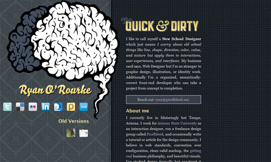
Another split, one page site. Cool hover effect on the brain graphic, and interesting combination of background patterns (one ornate, one techie).
Brilliant effect on the blue markers, telling you exactly where you are on the page and keeping things dynamic.
A custom font makes a big difference. Big, bold, boxy, but not overwhelming.
Not so exciting fixed area (they’re more for utility anyway) but does well in presenting the portfolio.
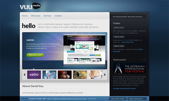
More than half of the page is fixed—narrow content areas isn’t quite dead yet!
I like how you start with a practically blank screen when you load the site. Then you get a simple yet dramatic transition animation to load each section’s content.
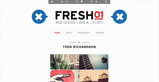
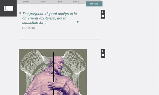
Another thing that isn’t dead: left-aligned layouts. No skimping on the amount of whitespace either.
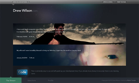
The thing about changing backgrounds is the foreground has to match, and amazingly enough, this site pulls it off. Other than that, graceful details everywhere.
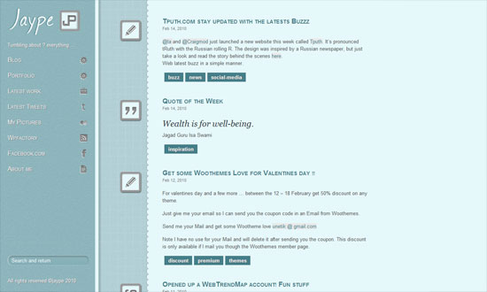
I like the three different shades of blue in three different columns. Not too thrilled about the use of the drop shadows and inner shadows here though.
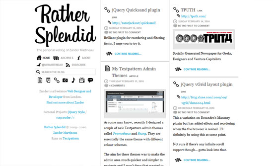
I love endless scrolling. I’m on the fence about the stark black icons, although they give a quirky feel to a text-filled site.
What really sets this design apart is the carefully chosen and crafted custom photos for each post, everything blends well. Not to mention custom type everywhere.
Social Media Weekly
Usability – Why Not a User
CSS – CSS gradients for all web browsers, without using images
