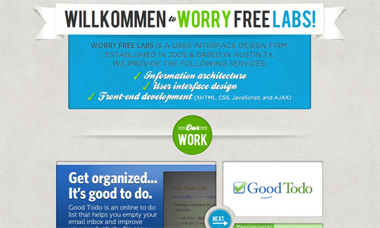
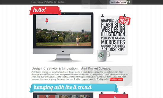
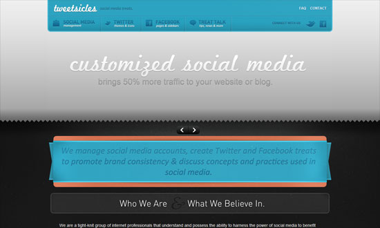
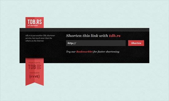
Using ribbons is really big these days, bringing both sophistication and a hint of nostalgia to this week’s designs.
Designs of the Week
The Work section slider is great. What I really like is the lightbox contact form—go all out when customizing it.
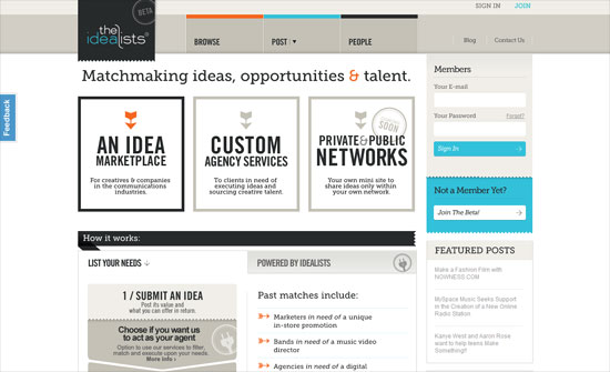
I find the gray shapes in the background an interesting touch, but needs better spacing, better association by proximity.
The details on this design are really fun but the colors—mostly the gray—seem to dampen the overall mood.
Doesn’t make much sense for the entire space beside the top left logo to be a hyperlink. I think the submit button could echo the glossiness of the ribbon.
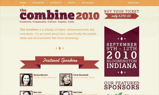
Love the use of textures on both the ribbons and the headings. I also like the diamonds, which do match with the angles of the ribbons.
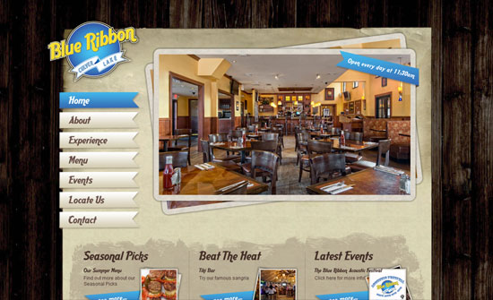
This site needs a description of what it’s about. What exactly is the place? Where exactly can you find it? Always reach out to your visitors.
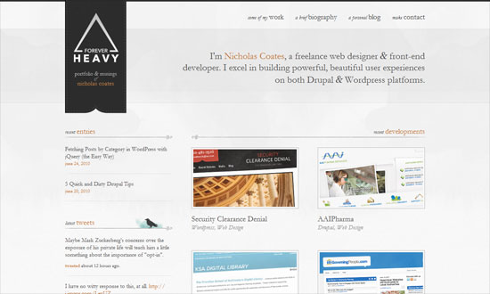
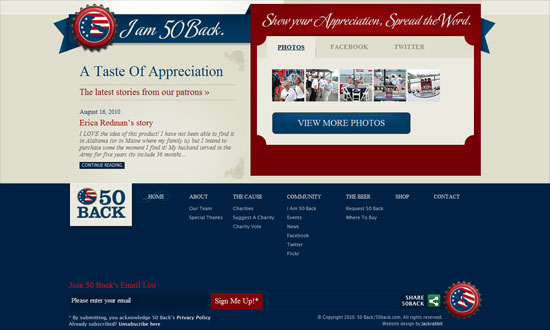
Put your logo on a ribbon like that, hanging like a flag, and you get elegance for cheap! Some texts are too small due to the delicate nature of Garamond, but don’t you just love the bird silhouette and that watercolor smudge behind it? Social media intergration at its finest.
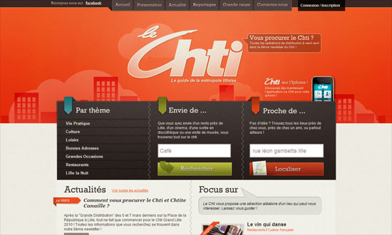
Header navigation is excellent but the “Connexion / Inscription” link should have been styled in a similar way. Other than that, really cohesive design.
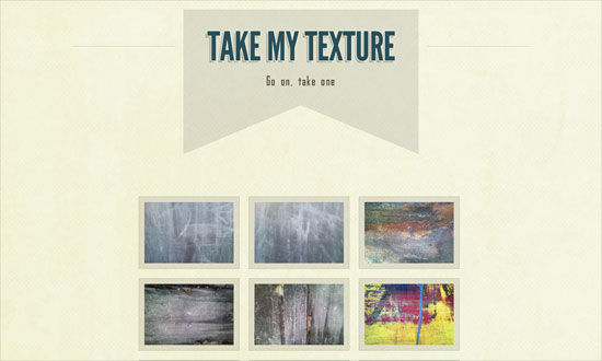
Straight to the point! And does away with default browser fonts.
I like every single detail on this front page. So imagine my disappointment with the membership request page.
The dropdown menu shape is neat, and it’s just the Times New Roman text that throws me off, but more or less fits the design anyway.
Social Media Weekly
CSS – BonBon Buttons – Sweet CSS3 Buttons
“There was a goal: Create CSS buttons that are sexy looking, really flexible, but with the most minimalistic markup as possible.”
HTML – WebKit HTML5 Search Inputs
“It just behaves like a text input. This isn’t a problem. The spec doesn’t require it to do anything special. WebKit browsers do treat it a bit differently though, primarily with styling.”
User Experience – How Choice Impairs Your Visitors
“Many sites provide an array of methods to interact with their offerings, but excesses in decision-making pressure can render less empowered visitors into a cyclone of stress from the barrage of questions being asked. As an industry, we place a great deal of emphasis on getting visitors to make decisions, but are we turning a straightforward path into a labyrinth with our need to know?”
